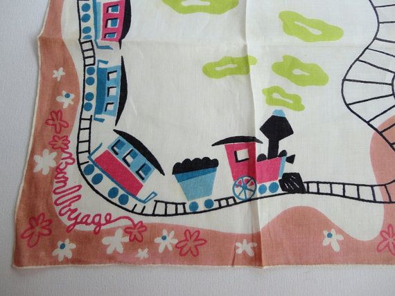
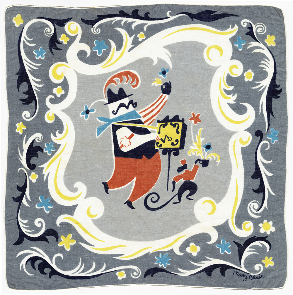
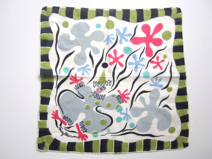
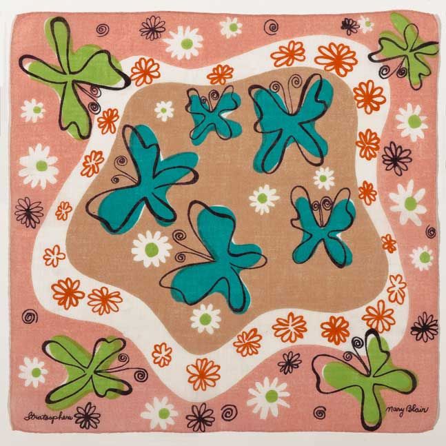
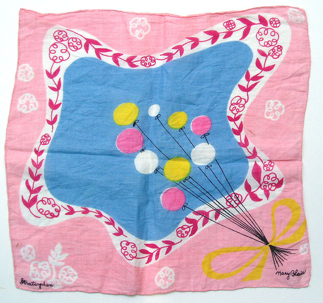
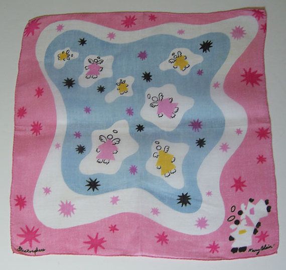
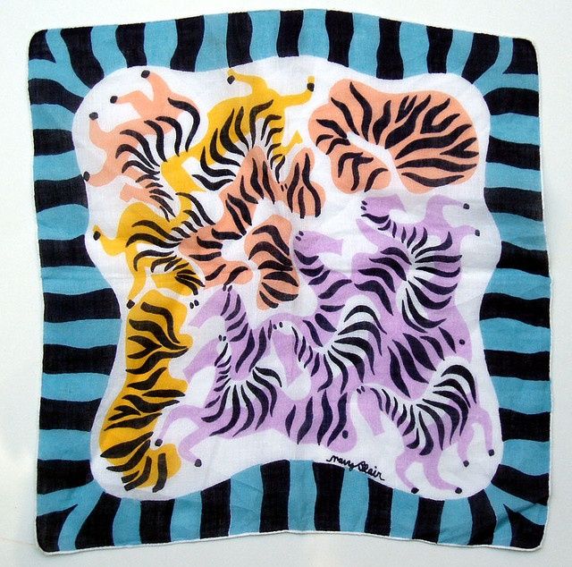
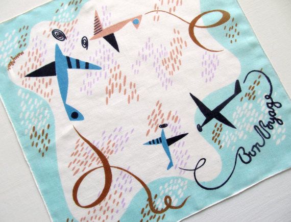
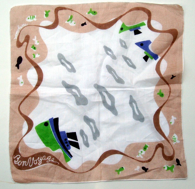
Mary Blair created a lot of things. Disney's "Small World" is just one example. She illustrated children's books (Golden), did some pretty cute advertising work, and is known for her work with Disney visualizing many of the classic animated movies as well as creating the palettes that really define the early Disney animations. Is Mary Blair known for her hankie designs? I don't think so...but she should be as she brings a whimsy and yet a strong hand and strong common composition to the hankies that are out there. And, do you think they are valuable? One person noted she bought a Blair hankie at a yardsale for $.25 and proceeded to resell it on Ebay for in excess of $150. More>> That is even better than Apple stock! Here are a few examples I have gleaned from the web for your amusement and my reference.
New New
The rain has stopped for now. If I were a mushroom, I would be tremendously happy. Its cool and humid and the lawn is out of control. We have these mushroom monsters, natural sculpture that have popped up overnight under the big pine trees we have in the side yard. These babies just "happened" and though eating something that big, and derived from a pine tree does not appeal to me, their immediacy and their presence is though alarming, is also quite miraculous. More rain for the weekend--so all the plump fruit can soak it in for maybe a nice hot July to transform blossom to bite for all of us. I am thinking peaches.
As I am in the process of bringing you all up to date, I thought I would share some of the work I have been putting out--that you may or may not see in our neighborhood.
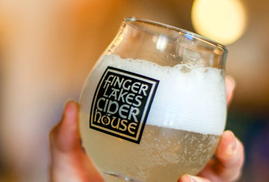
Today, I am going to introduce you to the new logotype for the Finger Lakes Cider House (FLCH). The FLCH is a new venture brought to you by Melissa Madden and her husband, Garrett Miller of the Good Life Farm, Interlaken, New York. I have been working with Melissa and Garrett on their farm logo and graphics/marketing/promo and when this gem popped up, I raised my hand to say that yes, I would love to take a crack at this. So later last year November or so, I started work on developing this mark--and this one, for me, stood out of the pack immediately. I am delighted that Melissa and Garrett agreed to this design.
The Finger Lakes Cider House is at the Good Life Farm and is a beautiful space (all built by Garrett and a team) that overlooks Cayuga Lake in a simple wood inspired space. I wanted to reflect the hand made quality of the space along with integrating a form that could be used independently (the apple and the seeds (called the seedstar)). So taking a page from my "way back machine" retro inspiration these day, I decided to start with the font and get something, (I know, god forefend) Celtic. Celtic! WTF? Miss Polly Pure Type is going off the deep end! But yes, friends, I did go Celtic and found a font that I thought would work, would express the handmade thing, and would be bulletproof (a phrase the fancy brandmakers in the BIG City would never, ever use--my new favorite that is bandied around is "mindful"--do not get me started).
What is bulletproof? Bulletproof means you can put the logo in anyone's hands (even a monkey) and your brand would still have integrity. It means applicable...even without a standards manual or 175 pages of dos and don'ts. It is a logo that is simple (one or two colors, no more), simple to apply, inexpensive to produce (xerox, output, rubberstamp) and is memorable. Bulletproof is branding made simple...and not a lot of chatter from consultants about how excellent your design team needs to be to apply it (read lots of work there with the big client). I have a hard time with logos that are just by design expensive to implement, and expensive to maintain. Why would anyone (client) knowingly select a full color logotype that has a gradient that you need a Masters Degree in IT and print production to even begin to use? I like it dumb (because that is the way I am)--and accessible. I do not think that it means bad or inelegant...but what is the purpose of a logotype if the last time it looked good was in the presentation to the client. The damned mark must look good, and fresh in most applications. Don't we all want to say that we designed "that" when people are loving it, happy. Isnt that the logo doing it's job? Plus with the added benefit to the FLCH logotype, is that we have fun widgets in the apple and seedstar to apply with the very distinct mark.
Enough of my jaded rant. Go to the ciderhouse. Its really fun, and they have well in advance of 20 different hard ciders available to buy by the bottle, with 5-6 on tap to have a tasting, a flight or a glass to see what all the fuss is about. I am delighted in this new local industry which truly has popped up in the last 4 years...and I am proud to say of the five ciders represented at the Finger Lakes Cider House, 3 (Redbyrd Orchard Cider, Black Diamond Cider, Good Life Cider) are designed by yours truly--and they do not look even like family members which was part of the challenge. More on that as we go.
Just be.
Another almost rainy day. Its cool and very humid here. Miraculously, our trash was picked up...and our wonder, Chet, continues to come to cut the lawn and make us look like real people. Don't tell anyone. We are just pretending.
Yesterday was a day of write a list, strike things off the list...and interestingly, I got quite a bit off my plate. A new label and mock website for Bright Raven Farm & Apiary (logo designed earlier this year), A new label pair for Black Diamond Cider (one with a woodduck on it). An amendment or two for the big client. A chatty fun note to the new interesting client. A pair of massive (6' x 9') banners for Sagamore (poor photoshop came close to dying as I was ressing up images to sizes unknown to this computer). And coaching Alex on what to look for with his apartment search in NYC...which I think we have one. Now today I have to find all the grown up stuff they need from me as a co-signer. Yikes. Down many, up a few. I hope I do not get stalled as the progress was remarkable.
It was an icepack on the ankle all day sort of day. Really worked. Going to do it today too. Very helpful. Also, no shoes...as it feels better to connect with the floor without a sole moderating that contact.
It has been fun working with team Bright Raven. They are trained biologists with advanced degrees from Cornell who love plants, ideas and really love the bee thing (which you know I do too). We spent a few hours talking about how to grow their business...and the wonders of things like expensive honey sold in far off places, the different flavors honey takes on from the terroir and from the nectar producing plants. We talked about overwintering the hives down south, and the appeal and fear of doing that. We talked about costs of buying a hive. We talked about schools, and helpers and broadening the community beyond the farm. A community to support the community of bees. It was pleasant to talk about things that we just need to understand and work with...but cannot control in the least bit. Weather, water, climate, food, nectar, flowers....none of these things care one whit about any of us. It just is. And that is singularly wonderful. We can just be.
If I keep this light, you will continue to hear from me. So, onward. The day advances and coffee awaits.
Swirlie
I told you I would come back today for our little chats. So here I am! Trying to get back into the swing of things. First off, before I forget this wonder, I have posted the most wonderful recipe (my recipe of the year) to the Treats section of this page. It is for a red onion and cilantro chutney or salad or whatever. You can eat it on its own, or dollop it on burgers or a side for a cool veggie plate. It embraces the constant wonder of fresh lime juice/cilantro and cumin. Make up a little batch and see how long you can keep it in your fridge. Not long is my guess. The book, Asian Pickles: India by Karen Solomon is filled with these gems and I plan on trying quite a few this summer.
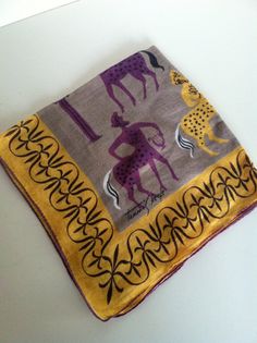
The mid-century modern hanky designer du jour is Tammis Keefe, born Margaret Thomas Keefe (1913-1960) and was one of the first designers to sign her work. The Keefe site quickly gives us a terrific bio:
"Originally a math major in college, she transferred to the Chouinard Institute of Art, now part of the California Institute of the Arts. As did many Chouinard graduates, Keefe worked for the Disney studios, and later became art director of the influential periodical Arts and Architecture, a publication renowned for innovative layout and graphic design. Next followed a stint in the California studio of textile artist Dorothy Liebes, who mentored many young designers.
Keefe became one of the first women to sign her name conspicuously on her work and to achieve name recognition. Lord & Taylor Manhattan even took out a full-page ad in The New York Times for a "Meet the Designer" day to introduce Keefe and a new line of furnishing fabrics. At the time, the major department chains, such as Lord & Taylor and Wanamaker's, were still temple complexes to the gods of mercantilism, with their own home furnishing departments whose buyers had national clout and influence.
Before her death at age forty-six in 1960, Keefe produced approximately four hundred designs for handkerchiefs and at least one hundred for dishtowels, all featuring her trademarks of unexpected color and subtle wit."
The Tammis Keefe website sums it up (go there to see broad selections of her work) . Gorgeous, whimsical, happy, imaginative, and celebrating the ordinary (such as hankies about housekeeping) and cocktail time. She is of her moment (Disney, Chouinard, Mary Blair, Morris Lapidus)--the incredible decorate and pattern everything with a particular, and distinct style. Her work and scope resonates with me...and I am sure there is lots to learn by looking.
Work awaits. I thought you might like the Tammis gumdrop. More later.
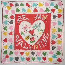
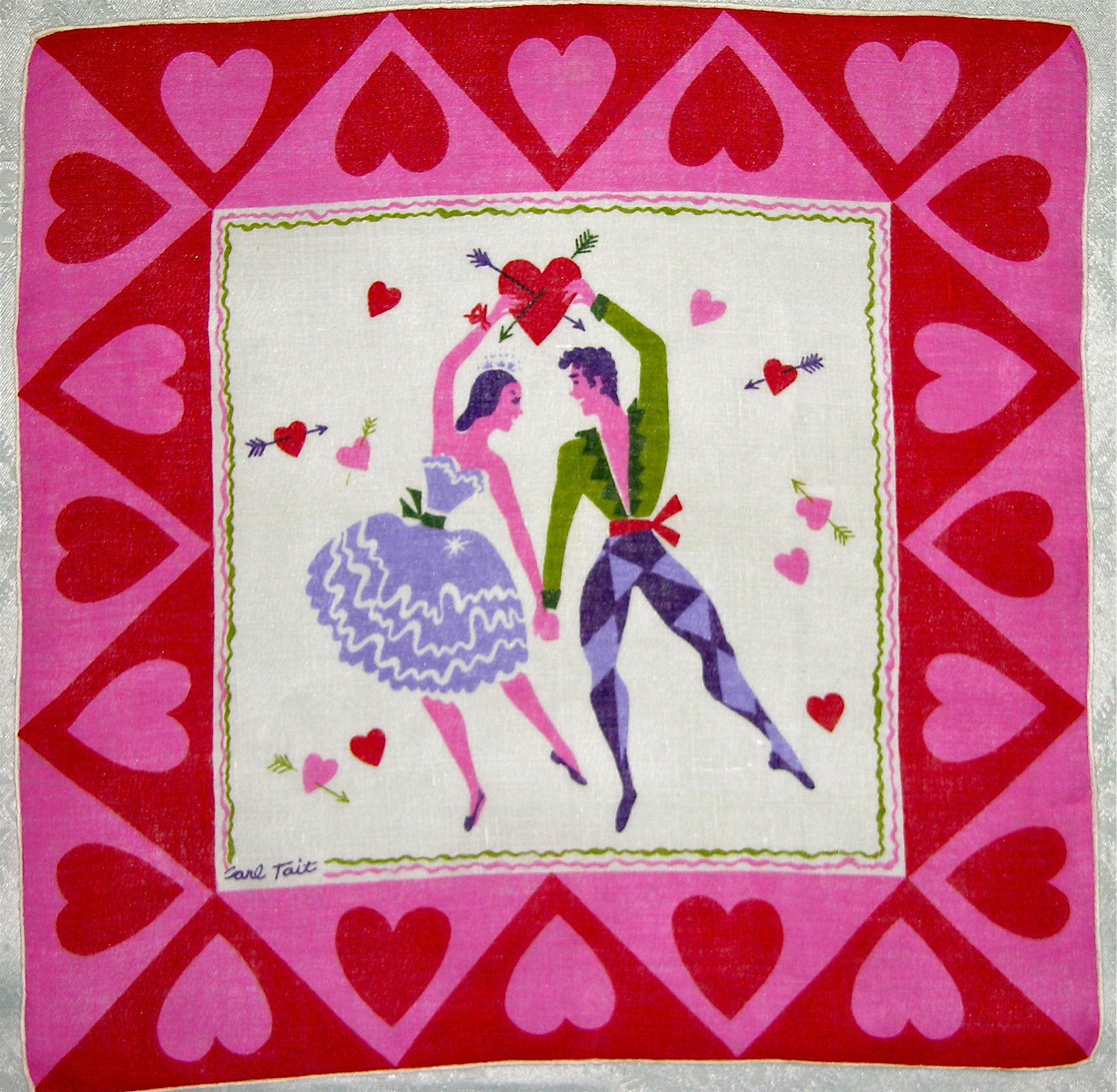
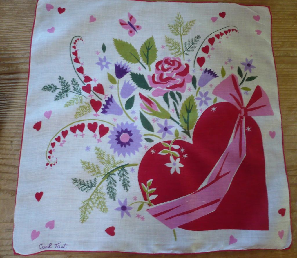
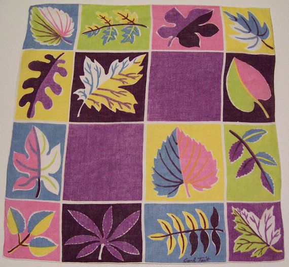
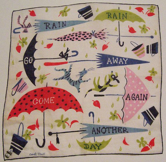
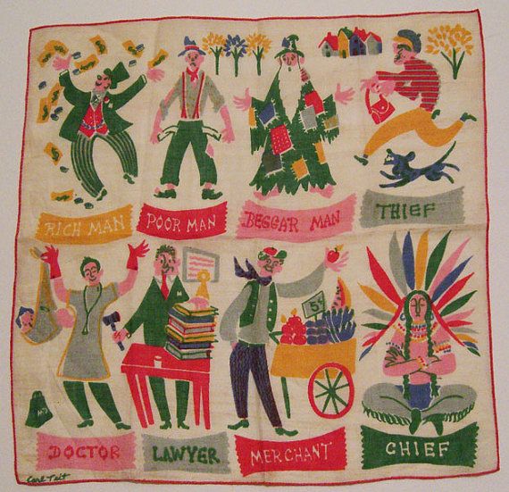
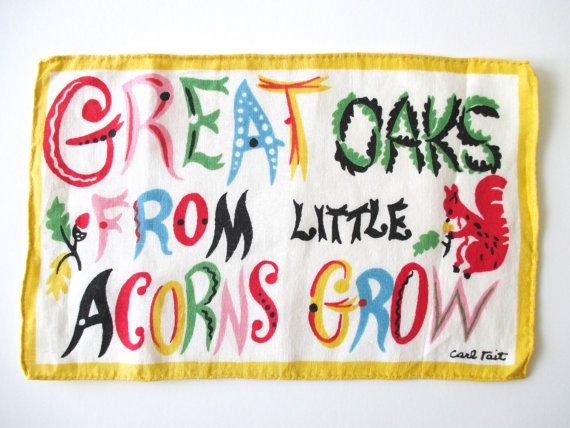
New sources for inspiration: Carl Tait
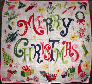
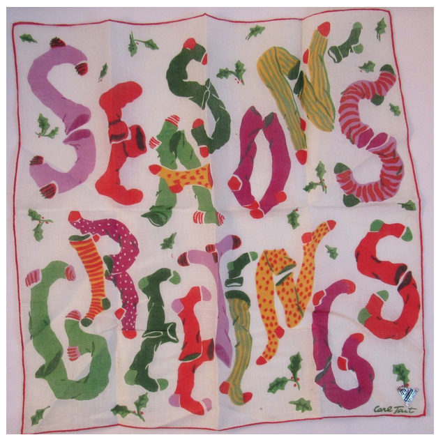
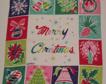
I have been seeking. Searching for inspiration, for a place to settle and drive my work. I think I have been too wiped out physically to not be charged up as I normally have been...but it hasn't prevented me for questing for that spark, that moment. Interestingly, I have been chasing mid-century modern in a big way as it is part of my life, and something that I can embrace almost as a curator. I have found that the decorative work is either in children's books, or in textiles...but editorial work and graphic design (only in a few cases) were very painterly and descriptive. However, I stumbled over printed hankies and haven't looked back. I will share these discoveries with you to share my excitement.
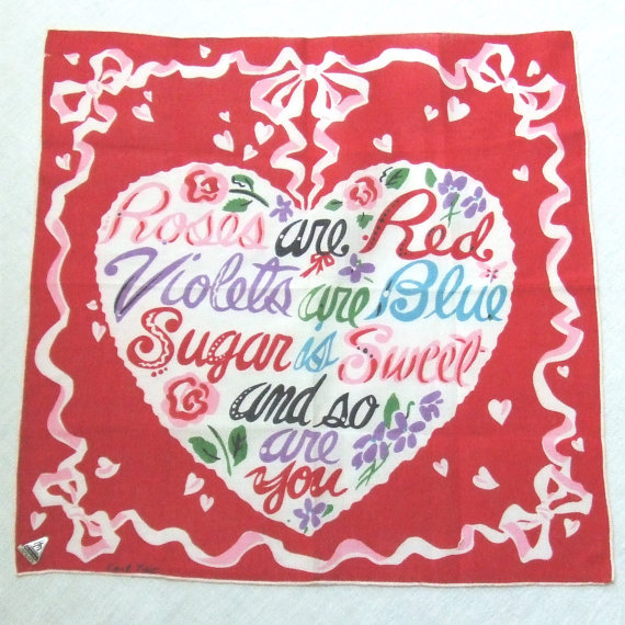
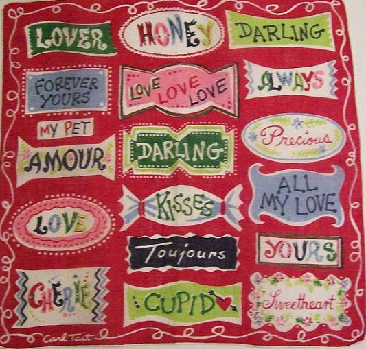
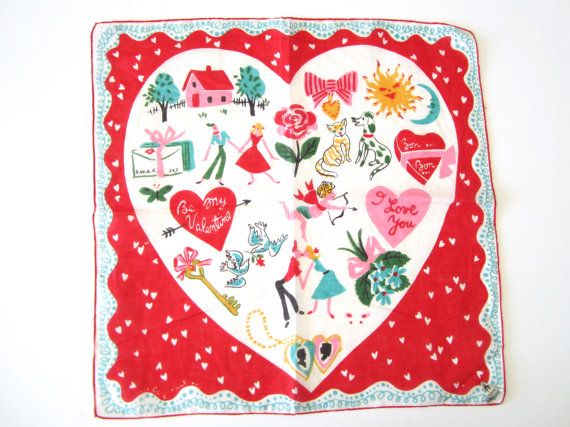
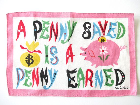
First Off, Mr. Carl Charles Tait ( November 2, 1917- May 11, 2011) is my absolute love today. I am fickle. but he ranks high love. Here is what the Times Herald had to say about him in this obituary:
"Mr. Carl Charles Tait, age 93, of LaGrange, GA, died on Wednesday, May 11, 2011, at Doctor’s Hospice in Fayetteville, GA. He was born November 2, 1917, in Old Town, ME, to the late Harry Tremain Tait & Mary Belle Madore Tait....After high school, he served in the United States Army Air Corps from 1942 to 1946. He graduated from New Hampshire School of Arts & Sciences. He was a creative and wonderful artist, with claims to fame such as a large mural that is still proudly displayed in the Greenville/Spartanburg, SC, airport, and Christmas cards distributed by American Artist’s Group. He even designed a line of handkerchiefs that was available exclusively through B. Altman & Company department stores. He also used his artistic talent and innovative spirit while working as an independent contractor for Milliken Corporation, where he traveled around the United States designing showrooms for product displays. "
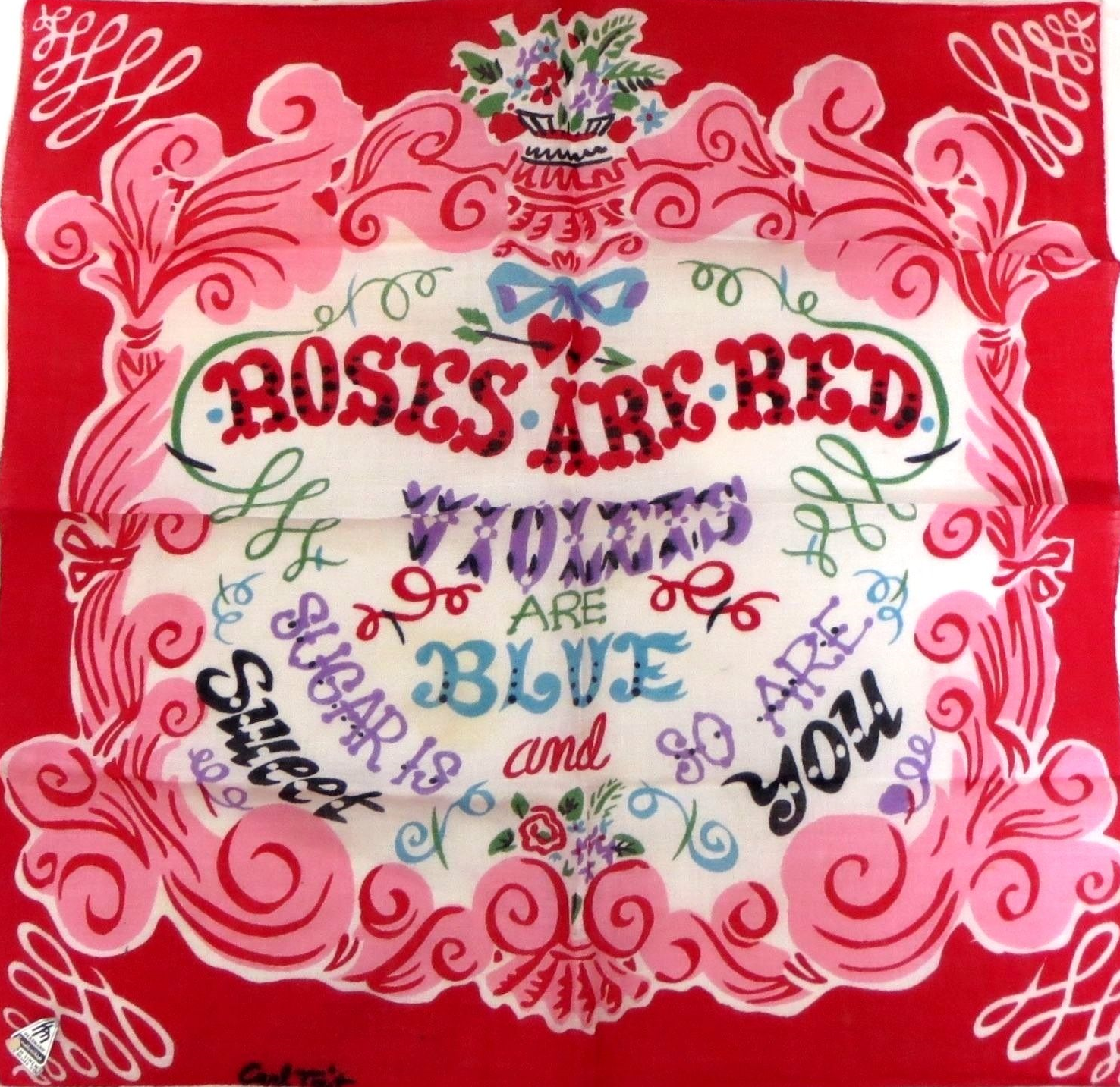
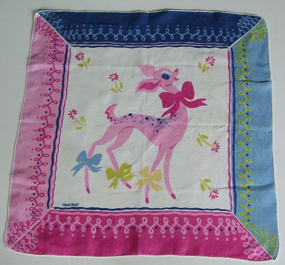
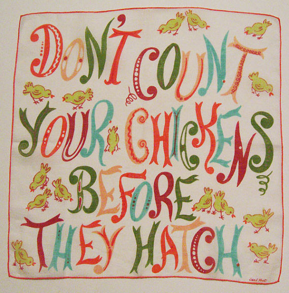
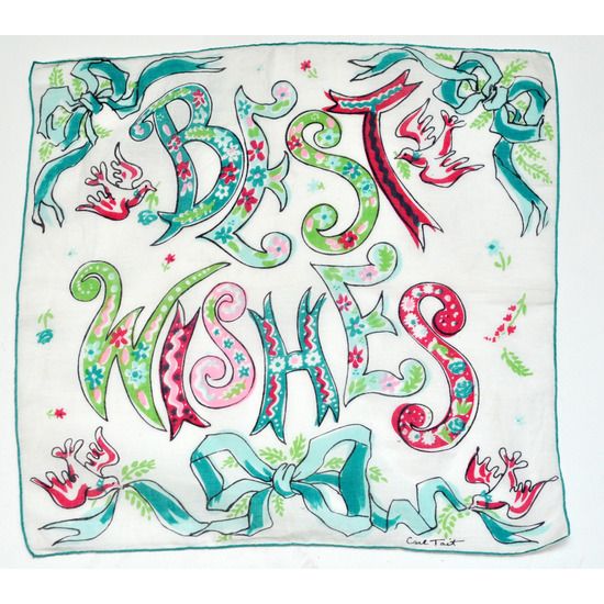
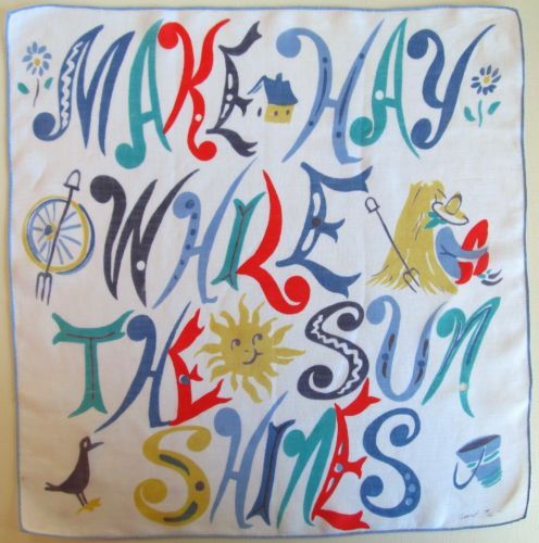
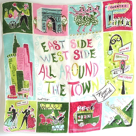
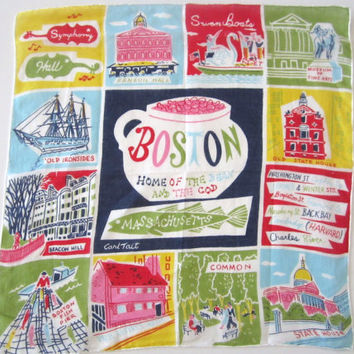
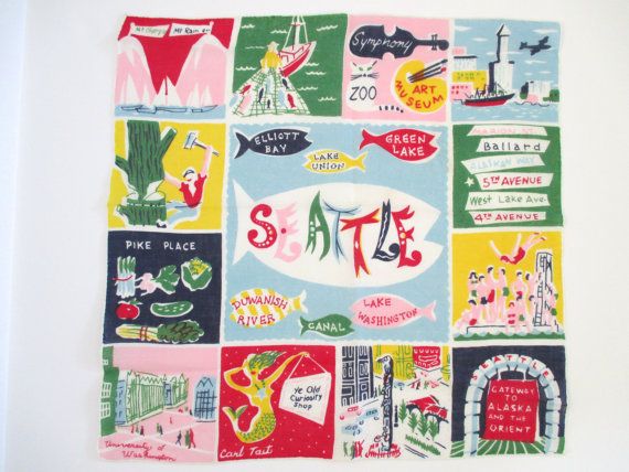
In the context of the time, Tait's exuberant designs, particularly focused on love and Valentines, these hankies explode (I cannot even imagine pulling one of these out of my pocket) with right color, vigorous line and active lettering. In the context of the lead children's book illustrators such as the Provensens, or Mary Blair's wonderful illustration and vision for Disney-- Carl Tait's hankies are in the front row of fabulous. His work centers on valentines, birthday wishes, Christmas, parables calorie counting and souvenir city hankies (Chicago, Seattle, NYC etc.) as hankies or also formatted as a 1x2 screen printed cocktail napkin/ napkin sets.. I have gleaned a collection from the web for your amusement and my delight.
Silence
Silence may not necessarily be golden. I was going to apologize for being so radio silent, but so much has happened to me, and my big world, that I had only so much space, and only so much ability to be discrete, tactful and adult (places I am not comfortable being)...that silence was my only way to manage. To, that, I have and to that, I feel that I am coming out of the last half year changed, evolving and yet able to come back to talk to you, my friends.
So, though apologies are not forthcoming, I am glad to be back. Really glad.
As you can see, the House of Q. is undergoing a template transition. Hated the old blog format...and really was worried about the gallery representations too...so I am trying this template on for size just to switch things out, and spur some activity. I think it looks a bit better. You?
So a bit of an update. My sweet cousin Martha, Martha Giltinan died mid December from a swift moving cancer/leukemia (Obituary WVGazette>). She had faith and continued to teach until the last moment of her life with us--and continues to teach even in her departure. She lived her last year deliberately, delightfully and in an inspired way. Truly, she went out like the rock star she was...living, expressing, loving, giving. It was a blow to all of us, and colored/heightened the dark months of the winter. I will in time, describe the amazing service for her in Pittsburgh which was, a singular moment for me, and I am sure, for many others.
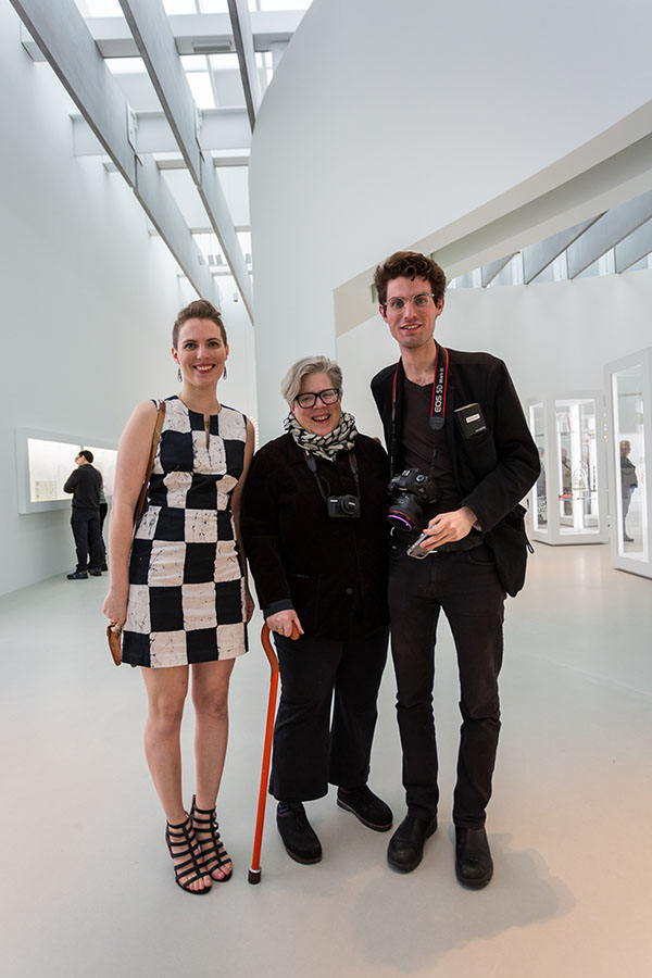
Other news: My ankle. Well, it wasn't getting any better. Painful to say the least...and my life evolved around planning my movement (when I go from here to there, what do I need to do, what do I need to take so I do not have to backtrack etc) so in mid May, I had all the hardware taken out of my ankle and am now in v.2 (as the word of technology says) with no hardware, bones filling in, and surprising less significant pain, but more healing pain, swelling (OMG) and range of motion pain. However, it is better...truly-- and though I continue to live with an icepack snug around my ankle, and I watch junky t.v. with the peddling machine-- things are beginning to look up. Beginning, mind you...but better than before May. The orange cane and compression socks are still in use. However, I wait and anticipate.
Rob got his building open. It is truly outstanding. A stellar achievement--for all involved. That is a remarkable 10year investment...and the results are, well, you will have to go to see it yourself. I am one not to gush...but I am stunned by how glorious the space is. Spiritual doesn't even begin to capture the feeling.
The Museum Association of New York had their annual convention in Corning (April) which was delightful and fun. I had the opportunity to speak which is always fun and surprisingly full of great energy. And it was a great platform for Rob, Devin and Dana to express the how MANY has changed and continues to change. There is some amazing stuff on the verge of happening...more to discuss.
Kitty finished up a long year of working at Petrune (a vintage clothing store) and at the Rongo as an expiditer. Lots learned...and out the blue had an offer to join a group of people to be part of the costume shop for the Aspen Music Festival--So she is there now...and I will update.
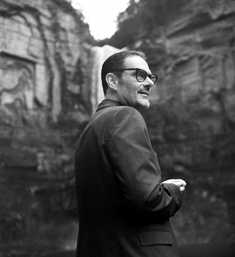
Alex is still at SVA (School of Visual Arts). Still reveling in the work, his new friends and mentors and taking really nice shots. He is still working predominantly in black and white, but his portraits and fashion related work are amazing. More for the proud mama to share. Here is his website for more examples of what is coming out of Alex's darkroom> Pretty good for a 21 yr. older...
I am still working with the local producers. I counted on my hands in a moment of boredom...how many labels I did over the winter and I think it was in the range of 15. Additionally, I did a brand for the new Finger Lakes Cider House, a new website for Sagamore along with IT work getting them set up with a new mail/ email service etc. So, the volunteer stuff hasn't gone away though I resigned from the Farmer's Market as they had the right people to do the job...and I had lost steam around that project.
Additionally, I now have a remarkable "WOW" client that I am not at liberty to discuss (yet). Lets just put it mildly, it rocks my world and it is equal to the USPS (to my thinking) as this company is global, touches a lot of people directly, is very "for the people" and is design driven. The project was swift and yielded some nice work...so August 2016 is going to be something special for me as I will be able to discuss more broadly. Lots of steam behind this...keep your fingers crossed that the work turns out well.
I am back. I could gab on all day and burn myself out...but time is on our side. More tomorrow. I promise.