The rain has stopped for now. If I were a mushroom, I would be tremendously happy. Its cool and humid and the lawn is out of control. We have these mushroom monsters, natural sculpture that have popped up overnight under the big pine trees we have in the side yard. These babies just "happened" and though eating something that big, and derived from a pine tree does not appeal to me, their immediacy and their presence is though alarming, is also quite miraculous. More rain for the weekend--so all the plump fruit can soak it in for maybe a nice hot July to transform blossom to bite for all of us. I am thinking peaches.
As I am in the process of bringing you all up to date, I thought I would share some of the work I have been putting out--that you may or may not see in our neighborhood.
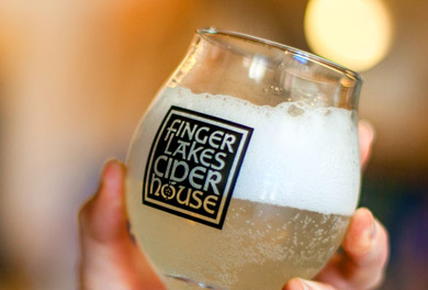
Today, I am going to introduce you to the new logotype for the Finger Lakes Cider House (FLCH). The FLCH is a new venture brought to you by Melissa Madden and her husband, Garrett Miller of the Good Life Farm, Interlaken, New York. I have been working with Melissa and Garrett on their farm logo and graphics/marketing/promo and when this gem popped up, I raised my hand to say that yes, I would love to take a crack at this. So later last year November or so, I started work on developing this mark--and this one, for me, stood out of the pack immediately. I am delighted that Melissa and Garrett agreed to this design.
The Finger Lakes Cider House is at the Good Life Farm and is a beautiful space (all built by Garrett and a team) that overlooks Cayuga Lake in a simple wood inspired space. I wanted to reflect the hand made quality of the space along with integrating a form that could be used independently (the apple and the seeds (called the seedstar)). So taking a page from my "way back machine" retro inspiration these day, I decided to start with the font and get something, (I know, god forefend) Celtic. Celtic! WTF? Miss Polly Pure Type is going off the deep end! But yes, friends, I did go Celtic and found a font that I thought would work, would express the handmade thing, and would be bulletproof (a phrase the fancy brandmakers in the BIG City would never, ever use--my new favorite that is bandied around is "mindful"--do not get me started).
What is bulletproof? Bulletproof means you can put the logo in anyone's hands (even a monkey) and your brand would still have integrity. It means applicable...even without a standards manual or 175 pages of dos and don'ts. It is a logo that is simple (one or two colors, no more), simple to apply, inexpensive to produce (xerox, output, rubberstamp) and is memorable. Bulletproof is branding made simple...and not a lot of chatter from consultants about how excellent your design team needs to be to apply it (read lots of work there with the big client). I have a hard time with logos that are just by design expensive to implement, and expensive to maintain. Why would anyone (client) knowingly select a full color logotype that has a gradient that you need a Masters Degree in IT and print production to even begin to use? I like it dumb (because that is the way I am)--and accessible. I do not think that it means bad or inelegant...but what is the purpose of a logotype if the last time it looked good was in the presentation to the client. The damned mark must look good, and fresh in most applications. Don't we all want to say that we designed "that" when people are loving it, happy. Isnt that the logo doing it's job? Plus with the added benefit to the FLCH logotype, is that we have fun widgets in the apple and seedstar to apply with the very distinct mark.
Enough of my jaded rant. Go to the ciderhouse. Its really fun, and they have well in advance of 20 different hard ciders available to buy by the bottle, with 5-6 on tap to have a tasting, a flight or a glass to see what all the fuss is about. I am delighted in this new local industry which truly has popped up in the last 4 years...and I am proud to say of the five ciders represented at the Finger Lakes Cider House, 3 (Redbyrd Orchard Cider, Black Diamond Cider, Good Life Cider) are designed by yours truly--and they do not look even like family members which was part of the challenge. More on that as we go.


