WRITING AWAY. Man. Soon. It was 8 pages on inspiration from the end of Syracuse to date...how I got to the thesis topic. I was quoting the Bible (you know you are in trouble when you quote the Bible)--and talking about hairdos from the 1770s.I pity the poor devils that have to read this drivel. It is a wild goose chase...but the shocker is that I have done a mess of work that really has driven me to where I am. Yes, I have looked at a bunch of work but the real push is finding a content area that delights you and whaling on it.I can see why Murray said no to more Memento Mori...I needed to do that a few more times to understand that this is where the heart is...and that the content and research if it delights you, evolves into work with heart, with weight with care. And we can allow that stream of thinking and work take us with it.
I need to knock off and make dinner
RIGHT NOW.
ketchup
Don't mind me. I will just scream. Right. Now. So, there I go...writing away, editing away, addings pictures--moving the needle with the thesis and the f-king InDesign decides to crap out and fail. Oy.I guess I can be philosophical about this but I think it is time to spend some M O N E Y and replace this boat anchor (I have been working on this macintosh solidly since 2002) as I do not have the time or inclination to put up with the crap. Okay. Here it comes back up again...and I didn't lose the document. The writing has been interesting and as it's supposed to be, very revelatory. New news today is that none of this stuff (the illustrations) come from nowhere. It is all a state of evolution. When I created a page on the memento mori work (as a decorative arts starting place) and then edited a page of the Garden of Eden work (which to look at it, had 6-8 solid contenders which could have been a thesis in itself) and then the current valentines (and the new few in the mix). Tighter work, better design, more resolution and finish in the work as we go further. The Memento Mori project was great as I learned a lot as an illustrator and as an old bag. The Garden project took those sketches a bit further with color (Memento Mori was exclusively black and white) and design. The current body of work, the Valentines, are colored and black and white, are redrawn and finished...not one shot off the pen...and they have type on them. In the Memento Mori blog entries, I talked about how much I loved creating patterns and frames to go with the pictures. I also spoke about how I needed to learn more about reflected illustration. With the valentines, I have pursued this and have a better handle on relected designs and adding a level of finish,adding backgrounds and context to the work, and integrating borders and frames into the work to take it further. In the Memento Mori work the frames were drawn by themselves. The spots were drawn by themselves and then mooshed together. For the Valentines, I have drawn a spot and then developed the frame or field on top of that illustration (often as a trace or tissue illo) working it to fit and integate with the entire illustration. It takes a bit longer, but I now have the patience to do that and embrace that changing and amending.
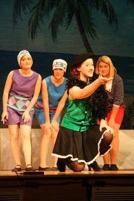
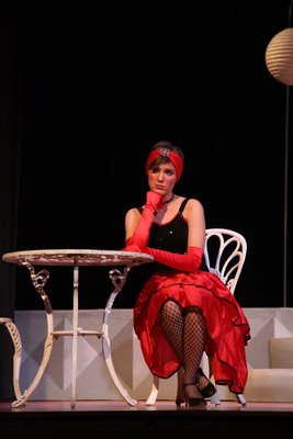
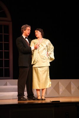
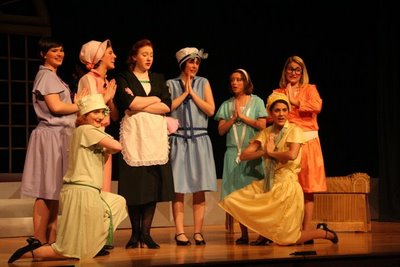
Tonight is the last night of Kitty's play. We have been to all the performances. It has been wonderful. Time to get the subs for the cast party. No kidding. Right now.
Later>>
IF: Talisman
A wonderful surprise!

Just got a note from Communication Arts Illustration Annual (#50) that the buffalo I did on a whim in response to my trip with the Hartford Group to Fort Worth Texas just got into this show! I am delighted! After hearing how hard it is to get in from our visit with Patrick Coyne, I am extra thrilled. This is my second year.... I guess this vector stuff has some traction!
Wednesday: caffeinated.

All pooped. Have been going to Kitty's dress rehearsals (with camera) until 9 for the past few nights. Tonight is the opener and so flowers are in order (we never do this...but for this one, we are), and I need to go buy tickets to tonights presentation. I don't think I will go to all 3 performances. Maybe tonight and Saturday? Need to get the food together for Cast Party and reconfirm the gathering tomorrow night.
Got an old book on the PushPin Studios with the hope to see the scope of the entire studio and to see more Barry Zeid (who is often cited by Murray). The Push Pin Graphic by Seymour Chwast with Steven Heller and Martin Venezky editing, and intro from Milton Glaser. Wow. This is a monumental inspiration for me. Its a style a day...reflecting Murray's quote from Today's Inspiration:
"I enjoy variety and I try to use style in the same way a typographer uses type faces," said Tinkelman in a 1970 interview in American Artist magazine. "The style is not dictated by whim, nor by the art director, but by the problem the job presents."
The work of Push Pin Studios confirms this feeling hands down.
Where ever these illustrator were in their lives, in their experiences, it oozed out of their work. Milton and Shirley Glaser found wonderful cut paper illustrations in Europe and bought them--and by sheer new application>presented them as illustrations. There were works on crummy newsprint with the bleed through as part of the final. There are ink paintings, line drawings, images that reflect the history of art. There are visual puns, and visual poetry. This Studio was monumental in it's reach at the time...and now, it is reaching out to me. I see great possibilities as I turn the pages to this fine book. They truly blend their love of type and typography with that of line and decorative illustration...so nothing goes untouched. Another revelation is how huge Push Pin Studios grew. I forgot Alcorn and Reynolds Ruffin's work. Glaser is so huge...its hard to remember that every single guy that was part of the studio was huge. More later
find Kitty in the Boy Friend Snapshots!
No temptations allowed
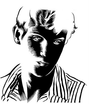
Oh no. I shouldn't have done that. Really, honestly, I shouldnt have picked up that tool and done a little doodling around with it...Trouble, simply big trouble is a foot now.I bought a stack of those lovely clean cut/buttery lino blocks and have had them waiting patiently for me since I bought them. Yes, I have a thesis to write. Yes, I have design work waiting. Yes, I have the Forever (Mandy declared, "oooh, that's creepy"---Mandy who has a me on her arm tattooed!) valentine to finish and the San Francisco awaiting! Plus, I have the SF body of work (6 Chinese inspired images) and the Growth body of work waiting in the wings...But I picked up the cutter and did a little..."lets see if its better than in sixth grade" trial run. OOOOOOOOOOOOH. Myyyyyyyyyy. I think the SF project may have a lino cut or two in the mix. This is so sweet!
Today is a dress rehearsal at the school which I plan on attending to take some shots in advance of the performance so I can stand where I want to...and get the shots I want versus being the polite mommy with a point and shoot (no flash) in the next to last row. And the "snacking" has begun. So, I need to remember to make a mess of snack materials to take over. Tomorrow, I make popcorn, I think. No butter...but delicious.
Hartford has some pre-work beginning for the July contact period. We got a great questionnaire yesterday for the Jean Tuttle and Nancy Stahl digital class that I am very pleased and excited about. There is so much to learn and these women are leaders in this arena...so it should be great. I just need to finish the thesis writing and then I can think about this. I am going to send out two valentines (next week) to get them blown up (24"x 36") and gallery wrapped (no need for frame) and see how it goes. I am thinking 2-4 big ones...and then the others smaller....maybe also output on canvas for ease of presentation....no framing, no mess/no fuss...First things first. I am thrilled as I found my old favorite resource (picturesalon.com)(had forgotten their name) and will be going back to them. They are terrific, nice and very affordable.
Gotta go...work and the lino blocks beckon..

Got the captions done. Started gathering the influences and captions which, if I dont watch myself will be wayyy too long albeit I love far too many people. I finished the introduction...so I have 3-4 areas and the influences done before April 1. This is okay. If I just keep chipping away, the 11th is not impossible.
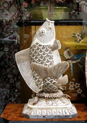
Working on these hawks (yinyang per client request). Redrew the fish to be coarser ...more woodcutty and able to reduce down to around 1.5" wide which it will need to be given the range of applications. Designed a cover to a pub. Pretty productive.
Gotta go make dinner.
Misty cold Monday
Wrote a bit yesterday afternoon--getting the marketing information, the biography and the Hartford information written and polished a teeny bit. Slugged in the valentines (need to caption). Started the intro. Plan on trying to do a section a day or so this week as time is ticking...and the captioning, the influence images/reference and captioning takes time. I was placing ink sketches in amongst the copy. I have been surprised by the quantity of scrap and spots I have. Really looks like something. I must admit, I enjoy the process of writing as much as I like writing and talking with you. it is very self revelatory that as the words hit the electronic paper, it winds ideas, thoughts and imaginings out, miraculously weaving them in places that just sedentary thinking might not do. There is a role for the subconscious in this free flow of words that seems like a second me, directing the thinking and where the ideas go.
We pencilled in our college trip for the week of April 13. We will be visiting Clark, Emerson, University of New Hampshire, Marleboro, and possibly RISD (for us...). There is all sorts of scheduling and form filling out, There are custom tours for arts students. There are general tours. There are interviews and information sessions. Oy. Too too much.
Back to the grind today. Tomorrow I get the car fixed (with a loaner for me--they promised). Need to finalize paperwork on the freezing damage from the lake--and get some notarizing which our lovely little village has at the Village Hall which also lets me gab with the nice moms and dads I know from school. Did I tell you one more time how much I love our little village?
Coffee awaits.
Sunday Morning

Still spewing valentines. There is the new Forever one in the cooker. I have a peacock in the wings. I would like to do an angel one, a Kitty one, an Alex one. But I might just stop after the peacock and call it the thesis (with additions as we go later). Am interested in a body of work based on the ideas from the Taschen book on Symbology combined with the current reading I am doing on Frieda Kahlo. Additionally, as a way to save my own bacon in the late summer, perhaps a body of work on the idea of growth and growing. This is inspired partially by Craig Frazier's topics he illustrates to stay in front of the corporate clients who want pretty much the same topics illustrated over and over again. I have the same problems, however, they dont like illustration except for illustration for the nondenominational, cultural bias'downplayed holiday card. They went for the tree of knowledge last year with great happiness...picked from a group of illustrations I was working on for the Garden of Eden. To think about it, growth was what they loved,so if I give it some muscle and have the time to open my head up a bit, this year could possibly be as simple as last. The holiday card has never been easy...so prework to make it easier is okay by me.
I am surprisingly looking forward to finishing the paper for the thesis. I have the peripheral work done, and as I think about the more specific topics--they do not seem insurmountable and once rolling, it should go fine. If I am not roped into a bunch of stuff today, hopefully I can begin to chip away at it. I am hoping to have the loose paper done by tax day to get to the HAS team for review prior to the pile on they will get May 1. Then, once we are back from the college look about tour, I will have a chance to amend, add and change to easily meet the June 1 deadline. After that, all I will need to focus on is framing and output. I converted the Sweetheart valentine to vectors and it is a ton of points and not a quick thing to scale, but none the less, its scaleable... I am hoping that the Love Lock snake valentine, and perhaps Forever might also go big 30x40 inches ish? I think it will be output, mounted to cintra and not framed. That would be big, bold and circus drop-centric. I love sideshow graphics/paintedd signs that are used in the crummy little country circuses that come through here and all the little local towns. Badly drawn but often very compelling...the sheer scale of these things make me very frightened of the poor person/animal on display> I have never paid the money to see the sight. The sign really does the job.
Bought a ton of groceries yesterday--Alice in Wonderland in the produce department. Mushrooms and parsley, cilantro and apples, field greens and scallions, green beans and asparagus. The formerly vacant refridgerator bulges. We have play rehearsals for K. all week with showtime starting Thursday> Saturday. A. is back in training and attempting not only running but high jump for Track. He seems to be intrigued by the flow of how one gets your body going in one direction and then up and over with all sorts of twisting and leaping to get over the bar. He's serious as he has goals already.
More later.
IF: Poised
update
notebook
Soldiering on
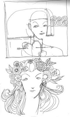
I have a bunch of hot things on my desk. None of which is exciting and many with way too many opinions and fingers poking it...so the outcome has a high potential of being mediocre. I mean, it should be helpful, really helpful. We can sing in choruses and choirs. We can play on teams. However with that, everyone has a role, a position where we are allowed to be good at what we do. The dynamic with design and illustration changes. The designer or the illustrator who has the role to make the images or create the environment is not allowed to be good at what their assigned role is. You are hired to be the expert and then everyone mother hen's you to bits --because everyone knows everything when it comes to the visual. Would you direct your heart surgeon during his work on you? Does one detail ideas, or direction to the dentist as he fills your tooth? I dont think so. However, our jobs are to struggle to keep credibility in the work and try to have it as high level as it might be if left alone. Urg. It is all pretty septic for me...and perhaps my meeting this morning with the fun foodies will get my head into a different place.
I am liking what's happening with the forever valentine. I output the shape and am noodling all over the layout to make the pieces to finish it. I am looking at borders and corners and an explosive willowtree (also in a heart shape) for the top. The heads of the left and right skull are going to get a little refinement. And the rose needs to be placed. Should be pretty active. I really am beginning to get the hang of this. I did draw it 3 times before I really got it. I had a bunch of layouts in my book from SF--so I came onto the big drawings with a better understanding of what I was to do than before...so it came together better. But what is surprising me is that I am enjoying the tweaking and noodling to finish the work when a year ago I might not have had the patience or interest in really taking it another step. Now, this is a place I am happy (and now anticipate) going. Another feather from the Hartford program. No one pushed me into this...it just has evolved from doing the work. Andrew Carnegie's "my heart is in the work" continues to be one of my favorite "go tos" as it so speaks to everything you do.
I'm sounding preachy. Sorry.
on the boards
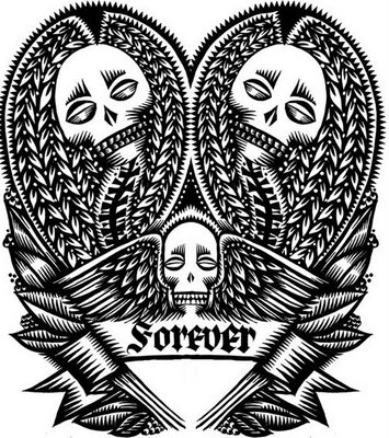
worked up in ink. Did two complete ones and felt they werent going anywhere. This one, though is...and the middle head is flipped. I like what is happening with the feathery wings. Handlettering...might look at dolling it up a bit. There is some drapery and maybe an urn to go in the lower segment, and a willowtree with a reversed out tombstone at the top. Also a big schmaltzy rose?
Notes on SF: Travel as part of the educational process
The San Francisco trip was my last ISDP trip with my graduate degree in illustration. I am somewhat bittersweet about the journey and the multiple paths it has taken. I have seen, experienced and engaged in so much with such a range of people that this study has been a blessing and gift for me. The travel is key to the program as it reinforces whatever path you are at the time. The exposure to such a wide range of speakers combined with the self teaching that the travel provides to each individual is jarring and revealing in the mystery of what one learns. Sometimes it’s a direct hit, an immediate “Yes!”. Sometimes the lessons are more prolonged--happening over time--providing support as the bumps emerge or the questions remain unanswered. But for a week, you walk in other people’s shoes; you see what they are doing, how they do it, and what their hopes, goals and aspirations are at that moment. These presentations are another measure for an illustrator to say, “hey, this is where I am” or “I could do something like that” creating options that may not have presented themselves otherwise.
With Hartford’s program, it’s even richer as it has Murray and Carol Tinkelman. They provide their combined experiences as an illustration and education team--along with deep friendships with many of the speakers that one gets carried along with the current of these relationships. Just a small example is that Carol encourages us to contact those speakers who we responded to and write a quick thank you note. I did this with Don Ivan Punchatz and have had some nice conversations with him post trip. He is another guide that I have acquired on this path to learn and grow--another branch in the progress, another person to talk and lean on. The amazing collegiality of these professionals is generous, kind and they all seem to want to reach out, to teach, to inform.
Our trips inspire others. It was so wonderful to hear Courtney Granner and Robert Hunt, in two separate instances, make a point of telling Murray Tinkelman that they too, were taking their students on the road to learn, listen and see illustration in
different cities with different orientations and markets. You could hear the pride and excitement in their voices as they embrace this other way to teach and learn. It is to the Tinkelman’s credit that this universe continues to expand organically--giving and taking, learning and teaching, adding and building the community of illustrators and image makers. It is a sweet cycle that I am honored to have been included in. It will continue as will the conversations, relationships, ideas and personal evolution now that new groups are integrating this into their learning.
Back at it. Setting em up. Knocking em down. Showed the thesis work to Murray and Mr. Andersen last week with good insights and reviews. Need to do a bit more hand lettering. Need to redraw the octopus from the good push from Murray "you are not loving your line" and "remember, as forms move away from the trunk, they taper" and he was right. Totally. So, the octopus gets a redraw, letters to be done...and need to find a resource as Doug Andersen suggested one or two of the pieces go up in size. I have already scaled up the Sweetheart piece (and probably the double snakes) to 30" x 40" which will be the centerpiece around which 2 groups of 4 will be hung. There may be more valentines in the paper/thesis proper...but 10 pieces for the show is fine.
I will have a valentine for San Francisco and a Memento Mori one that says "Forever".
Work awaits. Erich is out sick.
From SF: A bit on Brian Singer and his work.
“Engaging through inspiration”
Brian Singer, graphic designer for Altitude and creator/funder and engine behind the 1000 Journals Project summed up the general feeling in his final words to the group, “You have ideas. If you don’t take the initiative, if you don’t make it happen....you have...right......Nothing”. Brian Singer, also known as “Someguy” knows this to be true as this is his modus operendi for his graphic design and independant project work. Brian Singer does projects to engage the world, or as he terms it broadly, “marketing an environment”-- setting up public conversations in unusual and noteworthy ways. His dog poop project is one such example.
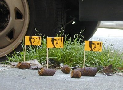
Singer, as a way to engage the community in expressing their distain for George Bush and his administration, established a website (www......com) with photographs of his litttle civic installations. Singer would search for dog poop which seems to be plentiful and a metaphor for his feelings about the former President--and stuck little chrome yellow flags with Bush’s face on them into the fecal matter. Photographs of these vignettes along with downloadable flag graphics were put up on an internet site (www. com) and the community engaged in the discussion. This project along with his art making from the poster and graphic detrius were just the warm up to his current project, !000 Journals.
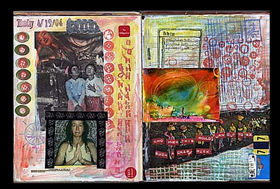
Singer created a concept over a five year span, to drop a thousand hard bound journals into the environment allowing people to express themselves freely without limits or public expectation. The concept was inspired by the graffiti Singer read in the public bathrooms while he was in college. Singer felt that the expression and messaging in these environments created open ended, anonymous conversations that gave permission to people to express themselves freely. The journals were to take that free expression to another level--having it become part of an individual’s journey, to hand it off or leave it for another, and so on. To create an open environment to communicate and then, in the end, to have these books return for further understanding. There was a system for the these numbered classic Canson sketch books to be scanned and quoted on an independant website whenever possible,
Brian Singer had no end plan. He wanted to get the books out through handing them to friends, leaving them in places, introducing them quietlyto see what would happen. He had no expectations about what was next. He had no expectations for public relations or image building for him. From his modest and self effacing demeanor, his passion was not necessarily for the outcome, but for the process, for the project and for the communication with the world at large. This project is where he put his money and time with no plans at all.
Four years later, thirty of the books have been returned. A documentary film has been created. He has been noted in the media from National Public Radio to television. There is an exhibit on display of a few of the journals that Singer was engaged in helping to design at San Francisco Museum of Modern Art (SFMOMA). Much of the news puts the project first with Brian Singer as the orchestrator and concept artist. I believe this is intentional on his part because for him, that is what is important.
Brian Singer believes that an artist must “engage through inspiration' using personal work, self authorizhip, fine art and professional work. He feels that all four aspects of this engagement must all happen in order to drive better work and thinking and cannot be allowed to languish. Singer lives up to this high expection of private and public voice to nspire us through his actions, words and projects.
I agree with Singer’s four prong approach to one’s work and career. I have repressed personal work, self authoring and fine art to exclusively focus on my professional work as a graphic designer until entering the ISDP programs at Syracuse and The University of Hartford. In hindsight, this is time lost. I believe that in developing personal projects, self authoring and fine art exploration through blogging, the creation and distribution of zines, web creation, on demand printing, drives personal projects, personal expression and a sharpening of a personal message, brand and understanding. To force this self expression beyond the boundaries of a job or a profession allows me to better understand what makes me tick, where my boundaries are, sharpen my communication skills and to delve into ideas. This personal expression has fed my professional work as a designer and has permitted me to better understand my own vision in addition to that of my clients.
