Chihuly at the Phipps Conservatory

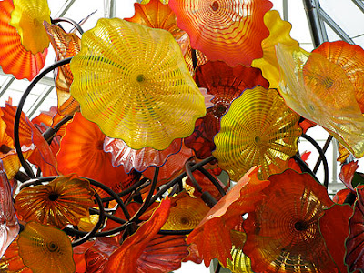
On Friday, a bunch of us went to the Phipps Conservatory in Pittsburgh to see the Dale Chihuly installation there. It was tremendous. The Phipps has been undergoing a growth spurt with new buildings, new conservatory space and a general upheaval of the physical plant. The windows sparkle. The plants are lush and abundant and are groomed and beautiful. The Chihuly work sings in this environment even more so than that of the Fairchild installation we saw in Miami earlier this year. His floating pieces in the almost black water was sensational and very evocative--making the flowers and plants resound. There was another more floral installation over a black pool that was stunning, with the glass reflecting in the mirrored surface of the water giving it that extra wow. There was a pointy star chandelier hung amongst the pointy palm leaves in a room devoted to cactus that was a beacon for the space but once you were there, allowed the plants to take center stage. If you havent seen one of these installations, they are great and worth the trip. Bless Chihuly for bringing glass and the things glass can do to the thousands of people that wait patiently in line to walk the entire expanse of the institution to see what other treat he has laid down for consumption. He is a master showman who knows what he is doing--and a spellbinder who can encourage the general population to visit a plant installation and LOVE IT. Plus, he has his own merchandise, work, posters, cards and sketchbooks for sale (priced dearly) that the crowd is happy to shell out for.
And they got rid of the wierd stuff like the enormous constructions of a zillion chrysanthemums configured to be something seasonal like a floral Santa in a badly constructed plywood, painted sleigh with plywood deer. Or my all time favorite, Humpty Dumpty at Easter. They also had a bunch of "themed" rooms like the Mill or the other, the asian room that were sadly realized and biased about the cultures they were to represent. Disneylike without the humor, style or frankly, the coinage to pull it off. Something they should return, was the man in the front of the Phipps playing the Wulitizer organ the entire time one viewed the flowers and the floral "displays". This ridiculous bouncy, roller rink music was truly the secret sauce that held all the wierdness together.

For more pictures, please click to the flick'r album. Couldn't resist.

More later on Pittsburgh>>

Society of Illustrators 50th Annual Show


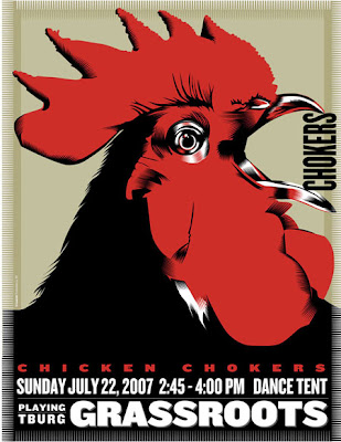
The Chicken Chokers at Grassroots got into the Society of Illustrators (truly, the best of the best when it comes to illustration) show in the advertising section which delights me to no end as it was a job done out of love for local culture, an admiration for the musicians and the tremendous spirit and verve they have and an opportunity, yet again, to do a chicken illustration. Three for three. And it gets into a fairly tough category to boot. Now, let's see who else is in? I heard Scott Bakal got in too! Yeah Scott!

The Awards Gala is March 28th, 2008 and exhibition from March 29- April 26. Artwork is to be picked up April 28th -May 30th, 2008.

...and now we wait


The turkey has been carved. The pie devoured. The little blops of cranberry, moved about the plate. "The Game" continues. And now, we wait. The minutes tick by until tomorrow emerges and we have coupons and cards to redeeem and spend on the wildest day of the shopping year. I am giving thanks in my small way that much of my shopping is done, wrapped and delivered. There is a bit more, but nothing a trip through Amazon might deliver without the blood, sweat and tears that the trip to the mall delivers with far less hassle and far more pleasure than the random shopping spree accomplishes. Imagine. Another Christmas is in evolution. Seemed a bit more possible with the grains of hale clinging to the windows and trim of the car this evening.

I plugged away on the Syracuse presentation which is lookiing quite polished and as I have a bit more time, I can expand a bit without much sweat. R. tuned me into some museum "tricks" with lap dissolve etc. that helps build an idea simply and effectively. Will manifest it here. Its a bit late. Need to put my head down.

Tomorrow, Chihuly at the Phipps. Hopefully a visit with Uncle Andy (Warhol) too.

good night!

Travel day


Yesterday, we packed up the kids, the dog and the wonderbus with presents, lunch for Thanksgiving day, and all the kaboodle needed for a few days including skateboards, tennis racquets and chalk for a trip to Pittsburgh to visit my mom and my sister and brothers and their husbands, wives and kids. We got off around 11 as R. had business that was time dependent as did I (the other Cornell holiday card was finally approved with tweaks and the ftp'ing to the printer in line). After that, we drove to scenic Burdett NY where R. had a phone conversation and we bought lunch from Deb at the Grist Mill. Deb is the very bright and kind person who runs the Grist Mill Cafe and is the lead baker and chef. Her food is great so we had sumptious sandwiches and fresh rolls to devour on the road. Once the call was done, the sandwiches were wrapped and packed and away we went. The trip took a little longer than normal as there was a long backup and traffic jam outside of New Stanton. R. was brilliant and conncect the dots getting us to the Turnpike and away we went...listening to Ithaca's own Mollie Katzen talk about her new vegetarian cookbook on NPR.

We are at the Westin downtown as they allow us to take our pets--and Shady was presented with a lovely dog bed with a big brown bone screenprinted on the center with Westin embroidered on it. She was delighted. We have all had a turn with her outside and though there are small patches of grass, she is finding the city life no different than that of the country except the squirrels are not a prevalent and the nature a little less. We had dinner last night with my brother Tom and his wife and children at Lidia's (1400 Smallman Street--The Strip District). The food was delicious, service was kind and fast, and ambience was comfortable in a large, warehouse-y space. It is italian--but not the typical Pittsburgh spaghetti and meatballs in a windowless, smokefilled place. It was italian--italian style. It was great having a chance to see Tom and his crew by themselves in preparation for the day of fun today. We left our family and took Shady for a little walk up the strip a bit. The clubs were swinging...and K and A were in awe of the whole club scene wanting to when they could go to clubs? had we gone to clubs? what was the club thing like etc? There were lots of young women in club attire--short short short with scarey spiky shoes and lots of hair. Many of the girls should not have poured themselves into these short tubes of fabric as so much of themselves didn't make it into the dress. it all promised to be an amazing night to give thanks for --for this set.
I guess.

Rainy and balmy/humid this morning. More later

New amusement and reference


This is absolutely inspiring and makes me thankful that I have a tremendous husband who sends me links of weight and consequence (versus the lightweight stuff that amuses me such as fez-o-rama...etc.). The British Library sets the bar high with their new online gallery, "Turning the Pages: leaf through our great books and magnify the details". The Library mounts their special books from the Lindesfarne Gospels, to Leonardo's notebooks, to the Sforza Hours and the First Atlas of Europe that you can literally turn the pages, magnify details, read the copy and do everything except sneeze on the original. They show the original binding and end papers, annotations, drawings. Jane Austen's History of England has these wonderful naive portraits drawn by Austen--an inspiration and insight to see her visual skills in addition to those literary.

Go here>>

It is a wonderful resource with a magnifying glass to see up close how images were handled, to note the palettes etc. I am hardly breathing with excitement.

This is your little afterdinner mint from all of us at The Rongovian Academy of Fine Arts.

Doesn't get much better than this.

image from the Lindesfarne Gospels

Disney is brilliant


More from Wiki:

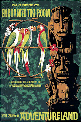
The attraction opened on June 23, 1963 and was the first to feature Audio-Animatronics, a WED Enterprises patented invention. The attraction's first commercial sponsor was United Airlines but sponsorship soon passed over to Hawaii's Dole Food Company who remains the sponsor to the present day. Dole also provides the unique Dole Whip soft-serve frozen dessert sold at a snack bar near the entrance.

The attraction was at first separated from Disneyland insofar as Walt Disney personally owned it through his own company, WED Enterprises, instead of the rest of Disneyland which was and still is owned by the Walt Disney Company (then Walt Disney Productions). The show was originally going to be a restaurant featuring Audio-Animatronic birds serenading guests as they ate and drank. The "magic fountain" at the room's center was originally planned as a coffee station (there is still a storage compartment within the base of the fountain) and the restaurant would have shared its kitchen with the now-defunct Tahitian Terrace in Adventureland and the Plaza Pavilion restaurant at the corner of Main Street, U.S.A. since all three are actually part of the same building. Since ownership of the attraction was separate from the rest of the park, a nominal admission charge of $0.75 was levied.

Since computers have played a central role in the attraction since its inception, Walt Disney's Enchanted Tiki Room was also Disneyland's first fully air-conditioned building. The attraction opened in an era when all things Polynesian were popular and was an immediate hit. It houses a Hawaiian-themed musical show "hosted" by four lifelike macaws whose plumage matches their implied countries of origin. "José" is red, white and green and speaks with a Mexican accent, voiced by Wally Boag; "Michael" is white and green with an Irish brogue, voiced by Fulton Burley; "Pierre" is red, white, blue and has a French accent courtesy of the voice talents of Ernie Newton while red, black and white "Fritz" has a German accent provided by Thurl Ravenscroft, who also voices Hawaiian god "Tangaroa" near the attraction's entrance. The four macaws as well as all the other birds are plumed with real feathers with the exception of chest plumage. The chests are covered in custom-woven cashmere which allows the figures to "breathe" in a lifelike manner. The choice came quite by accident; in a planning meeting, Harriet Burns noticed a cashmere sweater that Walt Disney was wearing which moved at the elbows exactly the way the engineers envisioned.

wiki tiki


Wiki Tiki is:

Tiki culture in the United States began in 1934 with the opening of Don the Beachcomber, a Polynesian-themed bar and restaurant in Hollywood. The proprietor was Ernest Raymond Beaumont-Gantt, a young man from Louisiana who had sailed throughout the South Pacific; later he legally changed his name to Donn Beach. His restaurant featured Cantonese cuisine and exotic rum punches, with a decor of flaming torches, rattan furniture, flower leis, and brightly colored fabrics. Three years later, Victor Bergeron, better known as Trader Vic, adopted a Tiki theme for his restaurant in Oakland, which eventually grew to become a worldwide chain. [1],

When American soldiers returned home from World War II, they brought with them stories and souvenirs from the South Pacific. James Michener won the 1948 Pulitzer Prize for his collection of short stories, Tales of the South Pacific, which in turn was the basis for South Pacific, the 1949 musical by Rodgers and Hammerstein, also a Pulitzer Prize winner. Hawaiian Statehood further drove interest in the area and Americans fell in love with their romanticized version of an exotic culture. Polynesian design began to infuse every aspect of the country's visual aesthetic, from home accessories to architecture.

Soon came integration of the idea into music by artists like Les Baxter, Arthur Lyman, and Martin Denny, who blended the Tiki idea through jazz augmented with Polynesian, Asian, and Latin instruments and "tropical" themes creating the Exotica genre. This music blended the elements of Afro-Cuban rhythms, unusual instrumentations, environmental sounds, and lush romantic themes from Hollywood movies, topped off with evocative titles like "Jaguar God", into a cultural hybrid native to nowhere.

There were two primary strains of this kind of exotica: Jungle and Tiki. Jungle exotica was a Hollywood creation, with its roots in Tarzan movies and further back, to William Henry Hudson's novel Green Mansions. Les Baxter was the king of jungle exotica, and spawned a host of imitators while opening the doors for a few more genuine articles such as Chaino, Thurston Knudson, and Guy Warren.

Tiki exotica was introduced with Martin Denny's Waikiki nightclub combo cum jungle noises cover of Baxter's Quiet Village. Tiki rode a wave of popularity in the late 1950s and early 1960s marked by the entrance of Hawaii as the 50th state in 1959 and the introduction of Tiki hut bars and restaurants around the continental United States.

Tiki exotica has enjoyed a resurgence in popularity, and Tiki mugs and torches that once collected dust in thrift stores are now hot items, largely because of their camp value.

mulling over ideas


Back from the House of Health. Car in the shop. Snowtires, balancing, registration, oil change. All done by noon, they promise. Tikis on the drawing board. Overhead doors ordered. Need to provision for our trip. And the poochita considerations need to happen. She is covered for December...she will be bunking with her pals, the australian cattledogs and their person. All is good there. They are promising us around an inch of snow today. There were cars with ice on their windshields this morning.

Spent the better part of yesterday gritting out the slide show for the stoonts at SU. Its coming along nicely...and its in a place I can fully begin to understand the beginning, middle, end with conclusions. Phew. It takes a ton of time to save down illustrations to bitmaps and then sock them into the powerpoint format. Erich is going to gather a bunch of office stuff...but the interesting parts are when illustration happened. Looks real sparkly. Good to do. Powerpoint is a stiff and not too fun program though.

If I were running the world, I would have each grad. student (in an illustration or design program) show a half an hour of whatever interests them...to the other students as a way of introducing themselves, and making them get a grip with this presentation thing. Now that I have spent the time, I can see a series of presentations that could stem off of this presentation that tells a story further. Its a good exercise. I assume everyone is a bit untried with this sort of thing...and you know, as soon as the degree happens, things happen and you need these tools and skills. Time consuming...but good.

Working on some tikis. Only have to get him done by the end of the month. I am making them way over complicated. I did, however, discover some fab tiki related sites:

> Tiki related hats>> "Fez O Rama"
> London Luau: June 6-8, 2008
> London Laua art
>Hukilau>>
> Lots of excitement around Tiki Oasis:
(lookee there....Shag.org is a sponsor as well as Trader Vic, The Tiki Lounge and a bunch of liquor brands...)
check out their links page...interesting Vendors...makes you think.

More later>>

what to do


Man. Busy times! I need to get on the Syracuse talk. I was lackadaisical about the talk until yesterday when I decided I would talk about what gets me out of bed in the morning versus "this is what I do". Yes, I will prove that I am a graphic designer and show a range of stuff. Then, I will talk about boredom and the random decision to go to Syracuse for illustration.I will show the SU illustration segue-ing from one group of birds to dogs to .... Then I will get into the world of death. Why not? As a few of my friends and clients have pushed me when asked what I should talk about...they always circled back on how I like to take things and make them into something else...and MM does that, focuses my work, will evolve into all sorts of things (maybe including tikis) and the illustration and design will take on a life and audience of it's own. Cool. Right? From someone's mom... All R suggests is platinum hair and a few tattoos and I would be in there swinging(and he is partially serious). However, with some Ray Orbison glasses and Laurie Anderson hair...that might be a closer option. I am thinking Ray Orbison even more than the hair. So, I need to rejigger the slides I have and add...along with sources of inspiration as well (yippee!).

Need to get the holiday party invites in the mail. Done from a design, printing and cutting standpoint. Ditto on presents. Need to get the client to please finalize their holiday card as no one wants a card after Jan1.

Working on Tikis for 2300 degrees at CMOG (note:all the cards on this link were designed by yours truly) for January. It is really fun, and this ink technique is looking way good. R. got an effusive voicemail from an artist who saw my work at the 171 Cedar Street Holiday "Cafe" Sale. I want to meet him and his wife as they are engaged in the world of Tiki and attend the shows in San Diego and London. If my work is suited for that, the concept of making a big body of work on the topic and going to these shows is very appealing. First, I need to understand what it really is...is it a state of mind? is it a particularly American state of mind? who are the kings of tiki? Beyond Trader Vics and my ultimate favorite Tiki reference, the Tiki Room at Disneyland--where is the center of this universe? What is the imagery? Where does Spollen fit in? He has hotrods in with the tikis and topless babes? Where does Shag fit in? More to learn. Can I fit the tikis in with the Imps of Death? Maybe?

More later>

ohmygod! a note from Kevin (as it was listed in the email box)

Who is this Kevin? Does he want me to buy real estate in Hawaii? Is he one of those random folks that have odd stock picks as related to one's astrological signs? If I open this letter will my computer fill up with the red ants of virus and hate? Or does Kevin have odd supplies and off brand ink for my printer? Is Kevin really his name? Should I open it...?

November 16, 2007

Dear Exhibitor,

CONGRATULATIONS! Your entry or entries have been accepted into the 50th Annual Exhibition for the Society of Illustrators. A Letter of Acceptance has been mailed. You will be receiving it shortly. This letter will have the specific entry or entries that were accepted into the 50th Annual Exhibition. We ask that you please refrain from calling the Society of Illustrators before you receive the Letter of Acceptance.

Thank you.

The Society of Illustrators

YAAAAAAAAAAAAAAAAAAAAAY!! Now its the waiting game to see what got in!!
Yayayayayayaya. Big time! Yeah! I really hoped....really!

Hello membership in SOI!

Crushed

Have been crushed by work. Its that time when everyone understands the year is about to end...and they need to get all the work they have shelved for most of the year...done. And we get it...and would love a bit more time to do the quality we want...but hey. It gets done. We all survive. Just with a little less sleep.

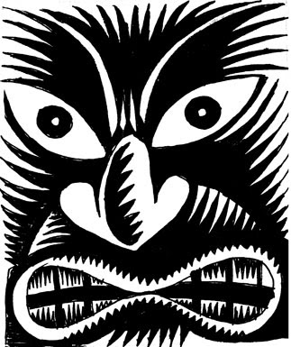
Will need to take a day or so off the Memento Mori drawings to work on some Tikis for the Museum of Glass. They are doing a 2300˚ event featuring the famous King Kukulele, and the musical feature will be Fisherman's Vibraphonic Tiki Orchestra--to everyone's delight. The tiki that the Museum is looking for should stem from the Easter Island heads versus the textury fun tikis that inspire folks like Shag etc. There was a cool show in London, the London Luau earlier this year featuring tikis that was a cool starting place. Room to move...and post Momento MOri, there is def a body of work in these guys too. There is a Saint Patrick's day illustration in the mix too. Maybe a little illustrative typography a la Tim Biskup woven with shamrocks and stuff. No leprechauns. A feminine illustration for the LPGA and 2300˚ using golf balls and a Motown musical reference (thats a head buster...I may go fluffy with that). So, I will be posting some of the sketches for your reading and looking pleasure.

Speaking of illustration, check out this month's Thanksgiving Mad Magazine. Our pal Richard Williams truly outdoes himself with the traditional Rockwell image of grandma and grandpa at the table with the turkey...only problem is that their guests are Nichol Richie, Paris Hilton, Lindsey Lohan and Brittney Spears all embracing their signature sins (drink, children, nudity, etc). Now that I know Richard, his work sparkles with his wit and technique...the job he did was glowing and beautiful. So run to your newsstand. Mr. Williams awaits on the face of MAD.

House of Health has been fun. There is this new breed of Russian Lady. They are the waterwalkers. These ladies gather in one lane of the lap swimming pool. There may be as many as three ladies together. They are neat and tidy and have these lovely, sparkling water shoes on their feet and they chat and walk up and down the lane for twenty minutes or so. Up and back, back and forth. Some of these ladies have a tough time walking and moving outside of the aquatic environment. In the water they are graceful and happy. It takes the passion and intensity of the superswimmers down--as they are there, having a nice chat, keeping a dry hairdo--but moving and getting a bit more flexible in the wonderful medium of the water in the pool. the superswimmers have a passion and intensity that I love watching as these are folks that do not kid around. There are wonderful tattoos on the superswimmers from flora to a lovely bouquet of keys on one individual. There are goggles and caps...the nicest cap which is a pearly, white/silver from another planet. I am thinking there is a series of pictures of swimmers with caps and goggles...tight crop --portraits to really define it...of all sorts of people. Maybe call the body of work, "Bathing Beauties". Nice creamy mats. Cool palette using a bunch of semi off, acid-y colors.

Need to get plans squared away before Tgiving. We are off the join the clan don the Burg. Primantis in order. Tom promises something rootsy on the Northside. The cousins will convene. We will deliver 80% of the Christmas presents too. Rolling Rocks and Iron City awaits. Yikes!

Enough of this rambling. Need to do some file correction and a little research on CD sleeve production.

a tiny bit of crowing!


Just got an email this morning from the Society of Illustrators Los Angeles (SILA) regarding their Illustration West 46 Show. I got 3 things in: The Chicken Chokers CD (in the Entertainment section) and my "Fear and Rage" red and black burka image for display on their website. The illustration used on the Cornell Baker Institute for Animal Health's Holiday Card got an honorable mention and is invited to be in the physical show in addition to the website representation.

If you haven't guessed....
I'm thrilled. They may not be gold or silvers...but I'm in.

Yippee!

Interesting traditions


From Graven Images:

"The burial procession itself was a spectacle as grand as the Puritans could offer. The horses pulling the coffin were often draped with cloth painted with the "scutcheons" of death, probably winged death's heads, crossed bones, picks and shovels, imps of death, and coffins.....The mourners were equally resplendent. Many of them wore long black "Mourning Cloaks" with large white scarves around their necks, and "good gloves" on their hands. Often gold rings were worn under the gloves....rings still exist. They are sometimes ornamented with coffins, angels, or winged death's head and engraved with names or initials. The funeral procession moved from the meetinghouse where a sermon ws read to the burial grounds where more orations and players were read....While the coffin was still in the meetinghouse, it was usual to be surrounded by six mourning women traditionally garbed in black. After the burial the family conducted an "open house"for freinds where large quantities of food and wine were consumed."

"Before the day of the funeral itself, the rituals of invitation were hard and fixed and certainly symbolic. Gloves were traditionally sent as invitations to funerals....Gold rings were also sent out....they were only distributed to family and close friends. Rings, of course, were traditional at marriages. But the interweaving of rings and gloves and feasts at both rituals leads one to the conclusion that death ws conceived as a spiritual marriage between Christ and the soul,while corporeal marriage was its earthly counterpart."

Wow. Rings. Gloves. Food. Decorations for the horses. Food and Drink for everyone. I love the simple tradition here married with the printed materials and stones that surround this final send off. The Victorians took these trappings to a high baroque level..but the pared back version, to me is far more appealing..and interesting as these traditions were the roots of the insanity that happened a hundred years later.

Monday Monday


Everyone has today off but the slave driver (me). K is doing an outdoors club hike. A has a friend over and they plan on sleeping late as the night was long last night with too many movies. R. plans on haircuts, grass seed planting on the newly configured driveway. I have more Christmas happening--with much of it going into boxes to be shipped out this week. We need to get some speed around fulfilling the Art Trail final orders, getting the stuff framed for the 171 Cedar Art event and for getting on the walls around here. We have finally decided on a holiday party of those who have worked for us, with us or we have worked for...and the list (sans kids) is at 80 though I know a bunch will drop out. So, we need to kick the house into some semblance of order, get new pictures on the walls and get everything on the upswing as the end of the first week of December is Art Basel Miami...and it needs to all be in motion before we leave.

Need to write a bunch of stuff today and get some stuff billed. End of year thinking relative to the business needs to happen--thus the need to prod my bookkeeper and accountant to talk to me...so we can figure out how we are going to close the year and any surprises re taxes and more taxes that we have to pay. I hate this stuff.

Learned a little in the world of the Puritans. They would show pinecones and evergreens as symbols of (you guessed it) eternal life, Ever Green. There are some great images of hands extending out of the clouds holding a palm frond (very Edward Hicks-ish) out of the corner of a gravestone. And Crowns....lots of soul effigies wearing crowns....triumphant crowns of resurrection.
Whoa. Remind me to write a bit about the bad little demons that had a short play in this world. Love them.

hmmmmmm.


R and I had a very interesting talk about promotion this morning. I have been wavering between here and there about what I need. Do I need the Ispot? Portfolios.com? or the new offering the Directory of Illustration? First off, I am an art director--and frankly, feel competitive and anxious working with other art directors. I play nice...but such agita that surfaces my competitive dragon--and it is not easy to be pleasant. The thinking of why does this guy have this client, and or why am I helping this guy be successful when the work they do is equal or less than my own graphic design.

I have been incorporating my illustrations into my work evidence Steuben, a new wine project, the old wine project, work with Cornell. I have been selling work off the website and with Ithaca Art Trail. We are getting royalties on work both of us have designed together. So, we are driving the ancillary income stream. Next, the only work that surface with these web sites are clueless jobs (on spec, or total buyouts with quick turn around for $300 an image, or for entities like cigarette companies). All of that does not work at all for me. Third, the illustration invites people into the design work and vice versa--one helps the other for me.

The Memento Mori work will evolve into illustration, product design and development around that idea and content. My website is working and maybe another website will work too (not as expensive as these other places). What I need is a rep, a team of people to help me figure out an entree into the market and for the images that do not go there, a gallery (even local) that will carry my work. I would like to sell my little books (maybe through places like the Dia Bookstore) and would like to target the skate and surf market which some customized pieces and marketing would help.

So, probably no re-up with these organized illustration sites. My website can do the same work--and the exposure to art directors and art buyers is not really something that is going to effect my working in the markets and with the people i better understand who I want to work with.

More later>>

Hinting at Christmas!


The sample Lulu books came yesterday. I created one that was 8.5" x 11" in full color and the other, black and white in the "Crown Quarto" size. To use the hackneyed corporate phraseology-- our"key learnings" were:

--the paper and ink changes depending on the size and type of book.
--the lovely offwhite paper with luscious blacks only live in the 6"x9" and the 7.5"x 7.5" books.
--all other books are on a bright white (white is calibrated as a 96 --I learned about all of that trolling the paper at Staples and trying to understand what all that means)-- a 96 is a bright bluish white.
--Lulu has a good page that talks a bit about the paper and press work albeit they do not get into colorspaces of files etc.
-- Also, they only use two presses: a Docutech or a Xerox IGen3 (specifically for the Comic sized book in black and white.
--the Crown Quarto book I got back (printing "black and white") were on a bright white paper. The full color black and white cover was perfect. The single color interior was washed out, and to be honest, looked shitty. The solution manifested itself in either going for the cream text and black in the 6" x9" size or the 7.5" x 7.5" which gives you almost screen printed matte blacks. Or, to run the job as four color process, using the color to reinforce the blacks. In the Color book I ran, I put in "acceptable quality" stock imagery, imagery from my portfolio, solid and screen tint colors, solid and screen tint type, type in very subtle color moves to see what was picked up, what wasnt. The surprise was that in my vector work, the color ran extra hot (heavy red and yellow) really pushing the imagery. The more neutral the image, the better off we were. However, my guess is, if you have a portrait, the way they have their presses calibrated, the person you have in your book will be semi acceptable versus color like a corpse or a heart attack victim. The black and white examples I put in the color sample were good and dense...looking wonderful.
--Another key learning is that the black and white books that are saddlestitched are heavier paper (80 lb vs 60 lb) in all cases except for the creamy books aforementioned.

So, go figure. I might put together a little Memento Mori "holiday book" (being the 7.5" square to see how that looks. Could be cute albeit the subject matter might make most people cringe. I find it hard to think that this work lives in the world of halloween--and not year round.

Had a nice IM'my type exchange with Paolo from Lulu to find some of this stuff out...the customer service thing is very can do...and good. You can get an answer as you go...which is super good. They are not terribly techy--but they know where on the site you can go...to try to get the info.

Wrapped and tagged Christmas presents today. My goal of having it all done by Veterans Day (an annual goal) may not be totally achieved, but I am a good half way done. Christmas done by Thanksgiving is a must as December needs to be left open for work for my clients as the time speeding by doesn't register until is is two minutes to midnight and the concept of turning back into a pumpkin becomes very real. I anticipate pumpkinhood daily...sometimes hourly. Thus the desire for a blue pill or something illicit like that.

The new driveway is tres luxe. I feel I might be working for the folks that use that driveway. Next step, a tiny "powder room" under the center stairs. I am not a big powder user, however when I was a Lauder girl, I discovered that powder was up front and center to the whole makeup thing. It went on top of the spackle/ foundation and in a combination of foundation and powder you could eliminate all wrinkles, pores and anything that breathes and become an airbrushed face before the airbrushing happens. In our powder room, there will be no space for the foundation and powdering that needs to happen...however, it will serve for the daily needs a powder room provides beyond the powder. Another step is where the apple trees go? I got a pair of tree peonies in the mail on Friday (ordered in the throes of tree peonies this April/May) from the Park Seed company. We will need to heel them in tomorrow as the freezes promise to return soon...It feels a tad late.

Late here. Gotta go.

IF: The Scale of things


Death or life or life or death
Death is life and life is death
I gotta use words when I talk to you
But if you understand or if you dont
That’s nothing to me and nothing to you
We all gotta do what we gotta do

T.S. (Thomas Stearns) Eliot (1888–1965),
U.S.-born—British poet, critic.

The scale of death and dying looms over each and everyone of us. It transfixes us and can transform our view of living and life. We all gotta do what we gotta do.