Budding ideas.

I wish it would stop snowing. I wish the overcast grey would give us a hint of blue, a ray of sunshine but it is mud season, and we are lucky that we are getting snow dustings versus the big whammy that can happen here during the longer, colder months. At least we are on the up side of all of this and, not to be too delighted, it is light until almost eight p.m. So some progress is being made. And, did I mention, the snowdrops are up (not open) but up. They take their cues from a more subtle source than I do.

Day Lily Wreath, Q. Cassetti, 2014, Trumansburg, NY, Adobe Illustrator CC

Day Lily Wreath, Q. Cassetti, 2014, Trumansburg, NY, Adobe Illustrator CC

We are rolling into the weekend. Rob has a "State of the Village" meeting tomorrow and then we have to go off to Albany for a conference. I am dragging prints and cards for their auction (requested by MANY) as well as my digital office as I plan on working on a publication I have due, along with my adorable new wine label.

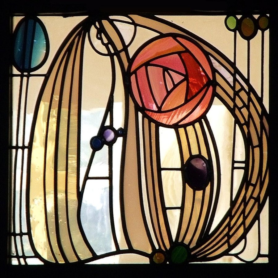
Hill House, Helensburgh, near Glasgow, 1902-3Charles Renne Mackintosh

Hill House, Helensburgh, near Glasgow, 1902-3
Charles Renne Mackintosh

My illustrator crashed so I lost a few hours of messing with roses..but easily replicated as the messing is the time. Now that I have it between the ears, I should be able to move it forward into reality more quickly. I am looking at William Morris, Charles Rene Mackintosh, Poirot, and others insofar as gorgeous graphic roses. Of course there are chintz roses, and muddy wallpaper roses...but styling in the Art Nouveau/ Deco is sublime. Did I mention Koloman Moser from the Vienna Sucessionists? Hubbard's roses from the Roycrofters? II  like how roses are snuck into anything that is floral... Tutor roses, love. Roses in the background of the Unicorn Tapestries. Love again. Poor Virgin Mary and her lilies and roses. Everything's coming up roses. Ring around the Rosy. Briar Rose. Sharp thorns, sweet scent--the polarity of experiences. Swimming in roses, in symbolism, in the icon, in the pure wild ones, and the hybridized cone we Americans think of as roses.

Cover of Successionist journal, Ver Sacrum, 1899, Koloman Moser (1868-1918)

Cover of Successionist journal, Ver Sacrum, 1899, Koloman Moser (1868-1918)

No roses yet to share....I have copped a few from some vector jobs I have done...but they are not lush enough. I am too parsimonious in style. Blowsy and lovely. Its days like this that make me want to be John Singer Sargent.

I have been asked to illustrate a calendar inspired by the writings of the writer Rumi (12 c.). I do not know the work (so I need to get on it)--but its pretty mystical, magical, spiritual stuff...which scares me senseless--which means I need to do it. Lets see what happens. 12 images by October. I can do that. No rush jobs...and frankly might kick me out of my malaise that I am in. Illustration Malaise...because it is Farmageddon here with labels and graphics for every producer in this hemisphere...from cider label programs (3) to meat programs, to others... and I am struggling to keep it all coming to their satisfaction. Jeez.

Gotta go. Printing on the fussy printer to commence (or my dropping it out of the second story window). It better pick wisely....or else (you know what's coming!)

Later.

That time of the year.

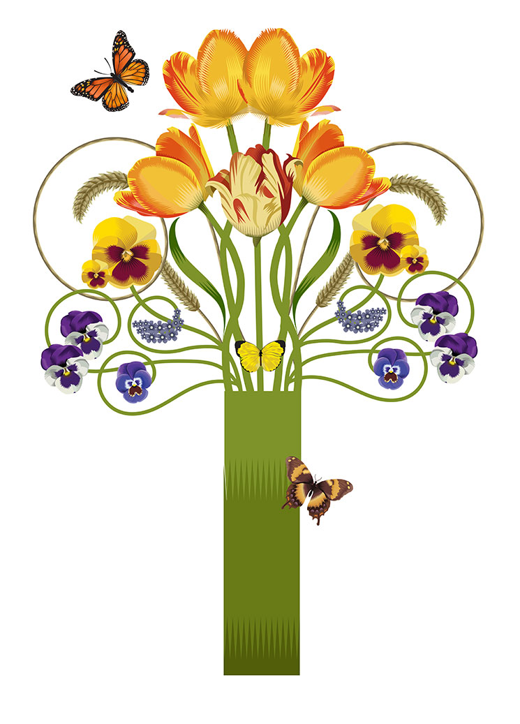
Spring Bouquet, Q. Cassetti 2014, Adobe Illustrator.

Spring Bouquet, Q. Cassetti 2014, Adobe Illustrator.

Budgets have gone in. The New Year has come and gone. We are still in the intermittent snow scene...with mini storms becoming puddles by the end of the day It is the time of the year for our customers to delve deep into those things that must be done by year end and begin to hunker down and focus on the work at hand. It is also past the time of planning and into the time of programming and purchasing for our farmer/ food producer friends. So, the work is falling out of the sky and clobbering me. We have labels, logos and bags, business cards,

It is also that time to plan the next season of Wednesdays at the Trumansburg Farmers' Market. We have such a good board filled with big ideas, our meeting are often filled with conversations, side bars, and overlaps. We are in the process of getting the music arranged as well as the secondary programming (everything from circus yoga to cooking demos, to obstacle courses, to story time. We will be having a story time at the beginning of the market this year (a new thing) and a bit of a twist on who gets placed when and where. We are looking to be more flexible around folks sharing spaces and dovetailing times (a spring/summer farmer with a summer/fall farmer. We had a great meeting last week with another this Thursday to put a final touch on the line-up. We are starting a bit earlier this season and may (at this point) finish up a bit earlier as well. Market lights are on the roster to get done to help with the later in the season sales. We also will be reintroducing the Tuesday p.m. community dish to passes (i x a month). That means essentially a postcard and mini poster to go on the various cork boards. We will see.

Melissa, Good Life Farm Farmer, is having her weekly summer CSA and then the summer subscription program at our house. Totally cute. She and Matt came in and propped the area with tablecloths, hand lettered signs, and lots of information and clip boards last Friday. It was such a pleasure to get our boxful of microgreens, sprouts, teensy sweet potatoes and a small container of maple syrup to start the fresh food for the year. She is also running a subscription CSA on Farmigo.com where one can sign up for a variety of foods, meat, bread from Wide Awake Bakery, herbs, mushrooms, and they are delivered weekly with the vegetables.  No shortage of great ideas from Melissa. Getting all of us out of the box.

I am still in some pain with the healing of this ankle. Pretty intense swelling...though the wound is daily looking better and better. There are also some sharp "icepick through the core" pangs that occur--so we will just take it a bit slower and get through another day of a little bit of walking and a little bit of standing, and lots of patience and at the end, fatigue. So onward. I had a 3 hour meeting with an hour drive both way, so I am just climbing back into what I missed and will need to catch up with later today/tomorrow.

Getting into the Swing

Myer Farm Distillers, Gin, Photo by Andrea Murray, Label design, Q. Cassetti

Myer Farm Distillers, Gin, Photo by Andrea Murray, Label design, Q. Cassetti

I have gotten phone calls, two actually, derived from the work I did for MyerFarm Distillery. Myer Farm is a family owned/run estate distillery made from their own organic grain. It really is quite something--and done really well from doing it right, right off the bat. Beautiful building, hard working/ inspired people, an attention to detail that in my world means 'sounds only a dog can hear" type of focus. I had the pleasure of helping them define their brand and establish a very strong look and feel for the company that allows for room to have a look for the clear/white products, a look for the browns and some area for flourishes if they want to experiment with flavors, twists on the pure distilled expecteds (gin, vodka etc). The work started as an exploration about what was right. As the family had had this property in their family way way back (probably when they named the counties after Greek and Roman celebrities)--I started with a clean take at Victorian. I gave them a few other twists and then decided to give them a clean, almost Scandinavian/ pulled back, lotsa white space approach that might marry well with the clean-ness of their new building and tanks. Another thing that was important to all of us was the ability of the line to keep a strong brand tie in..so on a back bar, the bottles would "represent" the family while still maintaining context within each section of the bar (gin with gin, bourbon with bourbon, vodka with vodka). The only place (besides a home bar) that the collection from white to brown would be shown together would be the tasting room. They liked the scandia design--and off we were to refining it and moving it to incorporating simple, one color Q illustrations in with the name and similar typographic lock up on each. Nice, clean, distinct.

So back to why we were talking. Well over a year ago, it struck two parties that they liked my work for Myer Farm and wanted to work with me on new labels/logos for their products. One is a refresh of a solid wine on the market, a keystone of this winery's line, but not representative of the truly lovely, higher end wine they are producing. it is a fun wine to take seriously--and feel that a look see might be in order. It is a wine that would be refreshing with a lemon sorbet, or a ladies lunch of fruit salad, date  nut bread, and little cakes. It is polite, sweet, but not lacking in sophistication. It is not "smart", nor does it have gravitas.. It is a bit sweeter and sassier...but still--it should not be a joke or party til you puke orientation. Should be fun for me...as it needs to be serious and yet light. Beautiful but not severe. The girl next door--no divas allowed.

The other project was from a couple who have bought land and a house to buy hops and start brewing. They are a cool pair--and are moving from South Florida to the land of ice, snow, ice wine, cider apples, pulled pork, great rye flour, Rieslings and hops. They too, carried a Myer Farm card around for a year and made the call to me just this week!. They said in graduate school, that potential clients may have you sitting in their files, or pockets waiting for the right time to happen. And then it does. Lightening struck twice this week. We will see. The research has been a gas...so the designing and illustration should be fun too.

The Piggery labels (a farm to table enterprise)  for a whole slew of labels are almost ready to be completed. They took comps to the Fine Foods Show in NYC and got very positive response to the clean, white, two color labels (with some cute typographic things) and are coming up to speed about how to work with and read the input from the USDA. Repeat after me, "Nothing is ever simple". We have reworked the files well over 6 times (two of them being a complete redo). Heather and Brad brought  us a glorious collection of products to try (for dinner tonight). 

I have done new products for Myer Farm and Redbyrd. I just finished up two new hard ciders coming on line this year. More awaits in the cannon. More to share with you.

Time to ice my ankle. Yikes.

this and that

I was asked a few questions regarding my "reinvention" and liked where my notes were going . I figured I would post this just as a reminder to myself and maybe it might be of some interest to you. Here goes.
----------

I had a bucket list when I graduated from college. We didn’t call it a bucket list…and it was something I did not talk about…it was just a series of milestones to stretch for. I wanted a range of experiences and a broad range of project types before I settled down. By the time I was 28, I had pretty much completed the list and couldn’t figure out the next steps. I got great projects and great jobs after the bucket list was done— work that I never, ever had anticipated—so in a stretch for me, I decided to stop planning my future and to see what would happen. I figured if I could put effort into it, I could figure out the work and do it.

My business, Luckystone Partners, has been in business since 1997.  We are a small business but have had some pretty significant projects and opportunities. One was with a national client. We changed their brand, their packaging, their entire look and feel in 24 direct mail catalogs a year using an ancient collection of product photography with remote art direction of new products (photographer in NYC, us in the Finger Lakes). We were a solid vendor for this client and they pushed the limits of our 3 man team—with the traditional unreasonable deadlines, adding to projects that they would not pay for etc. Reverse auction pricing. A headache, but a good headache as it paid the bills. They got a fancy PR person from NYC who said she could not promote the look/feel that we were using because it was not done by a significant design team. The client decided that they would be nice and have me bid on the work I had been doing for the past 3 years against this significant leviathan design group. Versus going through the process of presentations and quotations on work I was performing (and frankly, knowing too much about the organization), I met with management and bowed out of the work saying that I understood their needs but also understood their desire to change. It was no hard feelings and that I was down the road if they needed me. It was very nice and frankly, for me, extremely liberating as every spare minute of my time was working for this account (on a retail schedule —read Christmas/Holiday was done in the summer) and burning out due to the other clients we had. There was no let up. So when I got that time back….I found I was feeling very stale, very blunted and not excited about my work. 

So, I started trolling the internet for a class, something to mix things up a bit. I didn’t know what, but I needed a change I had been at the graphic design game for well on 20 years and was not giving back to myself. I was the composer of other people’s symphonies. I was the arranger of other people’s messages. I was not in my work….

2005-2007

I found that Syracuse University had a limited residency program to get a MA in either advertising or illustration. This program was unique as it was 2 weeks in Syracuse in the summer, a week in the spring, a week in the fall (in other locations) that focused on mid-career people (many were educators). It was a question of advertising or illustration.  Advertising was already in my wheelhouse, so I opted for illustration as it was a scary stretch and something a professor at college had warned me to never advance (why is beyond me, but I listened). So, I sent in my money and waited. The first two weeks were paralyzing. The Syracuse Illustration MA was the Harvard MBA of the illustration world and I had no idea what I was getting myself into. There were gold and silver medal winners of the Society of Illustrators in every year. There were celebrated educators, painters, illustrators who could “do” Norman Rockwell. There were illustrators and cartoonists from MAD magazine to Boys Life. There were illustrators who did the work for Celestial Seasonings Tea. There were character illustrators who did Mr. Clean. The Con celebrities (Magic the game) were shoulder to shoulder with me.  The bar was plenty high. So, I grew….and struggled and grew. I discovered that I could compete and found a spot with this new community of people. I developed a vector illustration style—which resonated with me, and became a distinct look. I learned that the distance between illustration and graphic design was a hairs breadth, and that both solved visual problems except that the illustrator could have more of a voice and a point of view that as a designer (at least my generation) held back to allow the message to take center stage. I started entering shows with my classmates to find that the work got the recognition my graphic work did not. This was crazy—I was having fun, having a lot of self discovery and really pushing my work.

2008-2009

I wanted to continue this process so enrolled in the Hartford Art School (University of Hartford). They would take my SU credits and in a year, I could have a MFA in illustration. I wanted to continue to work with my mentor, Murray Tinkelman, founder of the Syracuse program who had migrated to HAS. I wanted to see if I could work in a new technique (hand drawing supplemented with digital) and build a body of decorative illustration. Hartford was a different and far more broadening experience—that gave me the space to evolve and develop a personal voice integrating illustration and picture-making into something  I use to speak to myself. I was able to wrap my head around what I was finally doing, I was re-inventing myself for an encore career (a new idea), where I could continue to do my work as a graphic designer (to keep my head in the game and candidly, to pay the bills) but to begin to migrate to new markets, new opportunities, new projects that might not come my way as a designer. I am now doing illustration work too—and find my graphic work is bending to being more decorative and integrating more illustration into it.

I do not know if I have reinvented myself because I did not know the end point (nor do I now) I know that this may be an evolution, but it was not planned—and it was a difficult birth. I think in order for me to change, I needed to get bored and see the person I was evolving to—and know that this was not the place I wanted to go. Self awareness was key—but also getting to the place where life experiences had trained me to take measured risks that others might not take. My thinking (and preaching) is that the bigger the risk, the greater the reward (measured and researched risks, but risk none the less). That first step into thin air is terrifying.  Going back to school albeit after the fact is one of the best things I have done for myself, at the time—was horrifying as I had to lay everything at the door, take down the walls and  be open to change. I was very nervous and fearful—and really could not articulate why I was doing this work, but knew I had to….committed the time and focus to move the needle focusing on my education the way I focused on work for other clients….only for myself. And now I am a changed creative. I can do more, and have the confidence to do so— My work and focus have changed along with my thinking of my next chapter of illustrator/designer. I haven’t left anything behind, but am building my future on a solid past with me, in the center of the equation.

More exciting Love Stamp articles!

Hi: The Pittsburgh Trib's Rachel Weaver wrote this article online about the stamp. Love it! Here it is if you do not want to click:

Published: Friday, Jan. 24, 2014, 8:57 p.m.
Updated 15 hours ago
 

Elizabeth “Q.” Cassetti is helping spread the love.

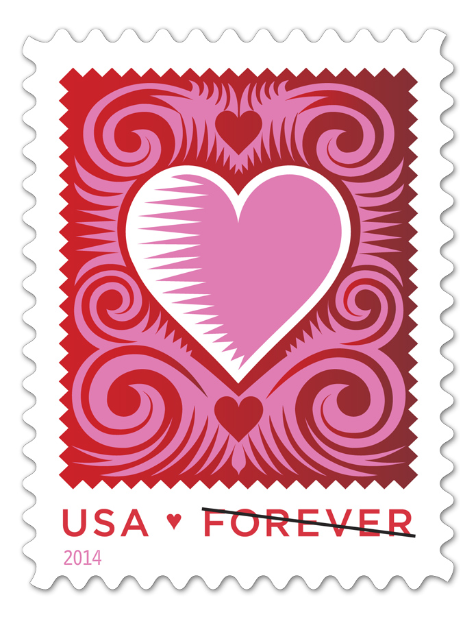
Cassetti, a Pittsburgh native and Carnegie Mellon University alumna, has designed the 2014 Love stamp for the U.S. Postal Service.

“This is one of those bucket list things to do,” says Cassetti, an Ellis School graduate who now lives in upstate New York. “The Love stamp is a tradition.”

Cassetti owns a design company called LuckyStone Partners and has worked for clients including Tiffany and Company, Estee Lauder, The Wall Street Journal Europe and The New Yorker magazine. She also posts work on her personal blog, which is where USPS art director Antonio Alcalá discovered her.

Cassetti has a longstanding love of valentines, having written a thesis on them during her graduate-school studies.

“I love symbolism,” she says. “Love is the universal. Its iconography goes way, way back. You can see a heart in a painting from the 1400s and know what it means. It has a really lasting quality.”

For her design, called The Cut Paper Heart, Cassetti took inspiration from Mexican cut-paper flags and German and Chinese paper-cutting traditions. It depicts a large, white heart enclosing a smaller pink heart with a saw-tooth edge along its left-hand side. Pink swirls surround the heart, and smaller hearts appear above and below it. A ragged-edge motif that echoes the edging on the small pink heart runs around the border.

“We are thrilled with the design,” says Roy Betts, USPS spokesman. “We hope people use it for special occasions and expressions of love throughout the year.

USPS produced 50 million of the limited-edition stamps. Betts expects them to last about a year.

The Love stamp launched in 1973. For Cassetti, being part of such a longstanding tradition has been an almost indescribable experience. She was “dumbfounded” watching the unveiling ceremony Jan. 21.

“It is exciting,” she says. “It can live 365 days a year as a way to show love.”


Read more: http://triblive.com/lifestyles/morelifestyles/5477226-74/love-cassetti-heart#ixzz2rQqN8bp0 
Follow us: @triblive on Twitter | triblive on Facebook

Reality?

The official portrait of Virginia first lady, Maureen McDonnell, painted by Loryn Brazier.

The official portrait of Virginia first lady, Maureen McDonnell, painted by Loryn Brazier.

Half an hour til a scheduled phonecall so I have a minute to say hi. As you can see, I am trying to get a bit more going on than the deadly silence that has been so much part of 2013 We will see if I can make this happen and continue to bore you with the day to day at 2 Camp Street.

Another bitter day and warm night by the fire being entertained by the MSNBC crew crowing over the new news swirling around New Jersey Governor, Chris Christie and the delightful news of greed around Governor Ultrasound, Virginia Governor Bob McDonnell and his lovely wife, former professional cheerleader, Maureen. I do not know which one I love more--the hamfisted folks from New Jersey--so clever, so clueless...or the absolute grasping demands of Ms. McDonnell from asking for a Rolex (for her to give to her husband for Christmas) to the money to fund a wedding the McDonnells surely could not afford, to the shopping sprees at Bergdorfs and private jets in NYC for that fun. Quite candidly, now that I muse over this, the McDonnells have the top spot because it is so stupidly "reality t.v.". so greedy and self centered, and so American in the most loathsome manner.  I love it that a campaign aide had to put the reins on Mrs. McD. over taking a very fancy Inaugural gown from Mr. Jonnie Williams, the ultimate "Uncle Sugar" (another new term coined  out of context by the loquatious Mike Huckabee). The McDonnells, hopefully, will admit guilt and get their own reality show to pay off the big bills and credit card debt that have backed themselves into. 

I admit, I am a Reality TV nut, but reality, in this case takes the cake.


Sub Zero

Rumor has it that the T'burg post office has sold out of the 1000 stamps (sheets?) that they were allowed to have. So, a reorder has happened...and hopefully, we can keep pushing the volume. I need to place my order for the double hit on my valentine for this year. Pricey...but hey, its PR.

Had a nice chat with the writer from the Finger Lakes papers yesterday and had a gander at an article from The Ellis School on this alumna. Ellis may try to promote the story more broadly in Pittsburgh (imagine!).

I am working with Joe at Pioneer Printing in Lodi on my personal valentine. Hopefully, we can get this rolling soon. It is def. the shoemaker's children here--as this project is generally something I have done before Christmas...and here we are, looking at the end of the month and no card. Jeez. Additionally, I am going to order some cards for sale from a new resource Digital Lizard-- a print resource that can do very small quantities, very quickly, very affordably. I need a rich mix of illos with 50 cards each which could financially strangle you using regular methods. With this resource, I can afford to do this almost as cheaply as printing it myself with a bit less hassle and handwork.

I am getting itchy to start drawing again. I really don't know where to go, where to start--but as you all know, the most important thing is to just pick up the darned pen, pencil, brush. Let it flow, baby. Feathers and frames, bees and bugs, twisty lines and big blocks. Just need the energy and headset to get jazzed. Need that.

This cold, this polar vortex is phenomenal. Awe-making. Awesome. This big house is cold...and when Rob gets home, he stokes all the little woodstoves, closes the doors, and steams up the windows to keep us toasty when the arctic temperatures are freezing us inside and out. I love how blue everything is--the long cold beige and purple colors...but is is so cold, so crystalline...it will be nice to have a little ease. Remarkable winter.

More and more

bella-thorne-012114sp.jpg

And it keeps on coming. Yesterday was a wild day of stamp buying and stamp rollout. The shindig at the Time Warner Building looked like fun with movie/tv star/celebrity Bella Thorne, along with a lady known for her scrapbooks and crafts. Twitter was rolling--and Facebook was alight. There were valentines to be made, and photos (with Photo Booth props) to be taken. As you can see, Bella and her fans took full advantage of all of the fun...and hopefully, sold some stamps too.

bella-thorne-012114-_2.jpg

I had a fun interview with a reporter, Tamara Lindstrom, from Time Warner News (here is the result of our time together). She is a fascinating person who not only interviews, but is on camera, behind the camera, writer and editor. all she needed were plates that she could spin, and clarinets she could play. Impressive. We had a nice talk about the stamp, illustration and the process. Seems that the process really is the thing our audience really wants to know about. Yes, I was paid for this job...and no, it was not a competition.

I have an interview with the Finger Lakes Free Press assortment of papers tonight. Katherine, the writer, mentioned that my stamp was news at the County Legislature yesterday (!)--and the local level of delight is wonderful.

Rob Bought me a sheet yesterday (more to come via online shopping) to chat it up anonymously with a lady at the counter in Corning. She was effusive about pink, and red and finally they had a REAL valentine stamp. That is the kind of happiness that I just adore. I hope this thing really reaches out and grabs our audience. Would be so wonderful.

First Day of Issue: Love Stamp 2014

Display at a Florida USPS Office featuring my stamp as the O in LOVE. Thank you to Amelia Sauter and Leah Houghtaling for the shot from the road.

Display at a Florida USPS Office featuring my stamp as the O in LOVE. Thank you to Amelia Sauter and Leah Houghtaling for the shot from the road.

Today is the first day of issue for my Love Stamp (2014) for the US Postal Service. How Exciting! There is an event at the Time Warner Building today (on Columbus Circle NYC) with speechifying and an opportunity for people to make their own valentines for people they love. Its all very splashy and fabulous...and for me a little stunning with the time I am spending on the PR that is being generated.

I just spent an hour and a half with an amazing woman who interviews and films for Time Warner Cable's news channel who is doing a little 1.5 min. feature on the stamp...and it will run in a few regional markets in the state. I wish there was more real content other than, "yeah, I did that" and even spinning one out is pretty thin. But, she is a remarkable person--that I am sure with a little cutting and pasting, she will create something salvageable.

I am busy placing an order with the Post Office to get my own little pile of stamps for my annual (yet to be figured out) valentine...which will have a stamp on it in some way. Should I buy all the commemorative stuff for my children (no, just more stuff is my thinking)? Once again, I would really love to see the data on this once they exhaust the supply. But somehow, this is not something that I think I could gain access to.

It has been work and sleep here. I am beginning to wallow a bit in a cider label system for a friend. They will be  coming out with their own hard cider (wine style) and want a series of labels...so I am on apples, and have been trolling font sites to see if there is anything that feels new, fresh and inspiring to push this ahead. I will be doing a few layouts using chalkboard graphics as a place to start which is very Ithaca/ Tburg from waaaay back before the chic Brooklynites started to own that world. The names they are entertaining are either very locally based and or farm based (for their farm). They love a more pulled back, more wine related label to suggest the market they are going for (which I will show them)--but I would love to see this thing have a bit more snap and pop...than something so "grown up". Does a cider buyer want their beverage to look more elegant and refined like wine? or something that has a bit more attitude and spirit than wine and even beer for that matter? We will see.


Monday in January

It's that time of the year, when dark bookends the day such that even at noon--it is only seconds away from darkness--that my friends, the producers and farmers rest, reassess and analyze what worked, what didn't, what will be new and what will stay the same. This is a busy time for me as I am on the new and fix it  projects--so I am busy working on finalizing a dozen labels for a local meat producer, a look/feel and labels for a new cider enterprise and two bed and breakfasts are coming on. I am inspired to move these entities forward--and hope that my efforts find traction with these ambitious people. Even in this quiet time, the deadlines are furious with the FDA and the Agriculture Departments demanding times for approvals and processing.

The Cut Paper Stamp hits tomorrow. Ithaca Journal ran a nice article today about the stamp--and then the furor will die down. I really would like to know how this illustration pulls for the USPS. I am sure that many of their illustrators do not care about the sales of their stamp, but I would love to know how this thing performed--particularly against the former Love stamp designs. I am sure this is information that is not shared, but it would be fascinating.

Come to think of it, I think I will post some of the sketches and layouts related to the stamp to have a a gallery on the work for those that come looking for this information.

2014 Must be the Year of unexpected public relations! There is going to be an article on my work with the local food producers and farmers in Edible Finger Lakes,  in the next issue. I had such a nice time meeting and talking with the writer and photographer along with prepping a folder of imagery for them to select from. We have all of this interest in the stamp and then in case we forget, the honor of being awarded Business Person of the Year from the Trumansburg Chamber of Commerce. Who knows what all this furor will bring.

And so it goes for today.