My client suggested we get going on the 2008 holiday card...NOW.
Given the struggle we had with getting the content right...he is right.
Why does it have to be so hard?
Imagine!
My client suggested we get going on the 2008 holiday card...NOW.
Given the struggle we had with getting the content right...he is right.
Why does it have to be so hard?
Imagine!
I opened my mailbox just after lunch with the regular "where is this?", "please do that", "think about this", "look at this", "call that person about this", and all the ancillary buy me, sell me, read me emails and there is this new name. I know this name as I have googled this person, Power Boothe, the Dean of the Hartford Art School! And Dean Boothe was writing me to ...imagine....welcoming me to Hartford. There's something new. A Master program paradigm for me. Now things are getting really exciting!
Boy howdy, this welcome is a novelty from an interesting person, no less. Trust the Tinklemans to migrate to a better place. I just didn't understand how much better.
Not to compare with Syracuse, but...the only exchange with the Dean were two. One, a cookie cutter welcome letter and two, the dissolution of the program letter. But I guess that is what tens of thousands of dollars gets you with SU. I wonder how many funding opportunities they miss by this sort of boneheadedness? Maybe if I had committed to funding a studio or lecture series or a building, I might have gotten an email. What do you think?
Higher bar with humanity at Hartford. Should be fun...and scary. Yipes!

Get ready. Get the tea brewing. Get snuggly. "The Complete Jane Austen" with Masterpiece Theatre on Sunday evenings-- With six books (four new, brand spanking NEW renderings--namely Mansfield Park, Northanger Abbey, Persuasion and Sense and Sensibility!) From the schedule:
Jan. 13 Persuasion
Sally Hawkins appears as Anne Elliot, a woman destined for spinsterhood after a proposal eight years earlier. Then her spurned suitor reappears.
Jan 20 Northanger Abbey
In a medieval house that appeals to her most lurid fantasies, romance addict Catherine Moreland (Felicity Jones) begins a relationship with the younger son of the estate.
Jan 27 Mansfield Park
After being sent to live at Mansfield Park, Fanny Price (Billie Piper) navigates a labyrinth of intrigues and affairs among its occupants.
Feb 3 Miss Austen Regrets
Courtship she knew well; only the last act eluded her. A film biography that dramatizes Jane Austen’s lost loves.
Feb 10, 17 & 24 Pride and Prejudice
Colin Firth is Mr. Darcy and Jennifer Ehle is Elizabeth Bennet in the definitive adaptation of the most-loved of all Austen novels.
March 23 Emma
Kate Beckinsale stars in the title role as the tireless matchmaker who professes no interest in matrimony for herself, only for her orphaned protégée, Harriet Smith (Samantha Morton).
March 30 & April 6 Sense and Sensibility
Though poor, levelheaded Elinor Dashwood (Hattie Morahan) and her impulsive sister Marianne (Charity Wakefield) attract a trio of promising gentlemen.
Wa-Hoo!
Studio Number One
3780 Wilshire Blvd. Suite 210
Los Angeles, CA 90010
http://www.studionumber-one.com
Studio Number One (SNO) was founded on the belief that art does not just belong in museums and galleries, it should also be an integral part of the visual landscape. SNO creates bold, graphic media that stands out amid the urban clutter, beautifying the environment while stimulating the public with innovative design solutions.
ART DIRECTION
BOOK DESIGN
BRAND DEVELOPMENT
EDITORIAL
ENVIRONMENTAL
FASHION
IDENTITY
ILLUSTRATION
INTERACTIVE
PACKAGING
POSTERS
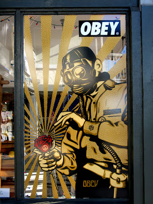
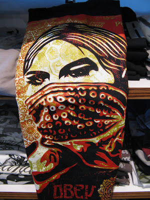
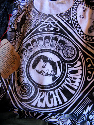
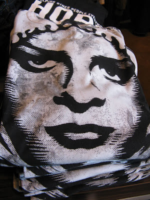
Guess who this is? Shepard Fairey! In my quest to wrap my head around what he is about--with the prompt from the Obey line of clothing (how is that managed? how does he justify (or does he need to? the porting of his art images to teeshirts and hoodies? Is it another licensing deal like Ed Hardy?).. His work in the stores reflect his print work with new shapes (probably not Fairey) but using his posters to promote his image and personal brand (framed in the store). In the hopping around, I found this critique of Fairey's work by Mark Vallen (sounds a bit like jealousy) which is interesting in his messaging...so if that is the case--now the plagarist is being plagarized by Obey the Purebreed etc.
There is nothing new about using old images as reference. Perhaps Shepard Fairey is a little close in with regard to how he uses those images, but somehow I think this helps in keeping his work as concentrated and good as it is. He could afford to tweak it a little further than he does (particularly in the nuclear image) in the layout--but overall, Fairey is taking the old image to a new place of his own propaganda.
I don't care what Vallen says. I think Fairey is a genius--repurposing images into other markets and using the funds and fame he garners into new arenas and ventures. This is a guy that is really carving out a broad swathe --from guerrilla art to art shows, to a design firm, a clothing line to promoting (and is funding/engaging) Swindle magazine to establishing a new gallery/exhibition space called Subliminal Projects, in the same space as Studio Number One. Subliminal Projects' Mission is stated:
"Subliminal Projects was created by artists Shepard Fairey and Blaze Blouin in 1995 as an artist collective, using skateboards as a fine art medium. By expanding beyond skateboards and apparel to include fine art prints, the group began drawing the attention of Aaron Rose, curator of Alleged Gallery in Ney York. As a result, Subliminal is one of the key groups responsible for cementing the relationship between the skateboard culture with the fine art world, working with the then-unknown artists such as Phil Frost, Thomas Campbell, Mike Mills, Dave Aaron, Shelter Serra and Mark Gonzales. By reintroducing Subliminal Projects to the current art scene, Shepard and Amanda Fairey continue to promote collaborations in the form of publications, art shows and events between artists of varying disciplines."
Look for his skateboards. They are great. I love the portraits and the vector-y swatches and flourishes. They are regal and very offical looking--with images of these guys with their baseball caps put on backwards. I initially thought they were dead gang members until I read who they were. There is that aura around them.
Juxtapoz has a great article on Fairey in their November 2007 issue.
Also, there are his books:
Obey: Supply & Demand: The Art of Shepard Fairey
E Pluribus Venom (pre-order)
I was struck with how polite everyone was to each other last night in New Hampshire--Everyone pleasing and thank you-ing each other, congratulating the winner (with some sort of nice recognition or anecdote), I thought I was losing it. What with the Brute in Chief, Rummy and all the rest of the monkeys (including Duke Blackheart) all flicking the bird at each other and the general populace, it was refreshing to see some practiced kindness and manners that elevated the playing field from the mire we have been existing in for the last eight years. It was impressive to see many of the candidates presenting themselves with intelligence, manners projecting an image of dignity. I am hopeful for many of the candidates--They seem to project a presidential air far more than anything we have seen in recent past. I don't love anyone (yet) but I am optimistic that change will be good. It seems someone is trying to listen to the heartbeat of our nation and perhaps rally us be stretching to be better versus ashamed of who we are. I am tired of Paris Hilton, Kim Kardashian, and the OC Housewives being the stretch for all of us versus educated and capable people who aspire to excellence versus the land of bling and sex.
I did a little tour of the newly revamped University of Hartford ISDP websiteand reviewed the portfolios of the 2008 and 2009 classes. My goodness, there are a wide range of really talented people in the program! Its a bit paralyzing. I am getting very, very nervous. And the alumni (also now on the site as well)--with what looks like representative images from their thesis work. I did say I was getting wired with this...so I got on my surfboard and wildly was searching more I could see from the program. Jim O'Brien has two blogs--one on Hartford with pages on their trip to Pasadena, Summer 2007 (with shots of the field trips, teachers, students and facilities) which is great as it fleshes out the imagination. Jim is very astute--and seeing the program through his eyes doesn't make it any less scary--but makes it very real. It looks very nice and very much like a program (not the class of 4 from Syracuse). So, it will be great to be in a bigger group of people with a wide range of skills and talents unlike the close in group of the past two years. So, yes--I am nervous...but at least I have a good idea of what I am getting into...unlike the SU experience.
Did I tell you I am was invited to join the group (HAS ISDP) in Texas as we will not do it during my stay at SU? Ticket is bought. Room reserved. I am excited to see the Texas illustrators, to see Murray at the Rodeo, and to meet with my future classmates and get some idea of what to expect for July. It was very kind of the Ts to include me.
Trying to get some work done and out today. Erich's computer got a new Motherboard from the Applecare guy that came to the headquarters. So, maybe we can get back to normal tomorrow...and get the scanner to be operational. I have a dozen sketches I need to stuff into my computer to finalize the Memento Mori book. Number two book is almost ready to go to press (LULU)--With plans for the next one being January 1, 2008- March 31, 2008-- I will have some scrap to start the thesis with. I was thinking I should really try to pencil in what I want to do for a thesis--with maybe a little statement (always good to do--lesson from August- October 2007--write a statement and you have something more than a random group of pictures--the writing makes it sensible and tangible to other people). Plus, with some writing at the same time as the creation of the body of work, it may drive more/different learning through the push pull that both activities provide.
Exciting to have the second book almost done. Not much writing or excerpts from my blab here. That was determined in October. However, the response is that people like reading it. Book Three will include writing --and continue where Book One left off. It will be interesting to see where the work goes in the next quarter. I do not feel like this is in any way exhausted...and with the reading of the last quarter, I feel ready to do a little personal riffing--and see where freeform imagining can take me. I may be looking at a font (derived from the gravestones) and /or some color palettes to take it a little bit further. I think I am still sticking with black and white. We'll see what happens.
I have been trying to work with the projector--and am inspired by what I can do with it...but it isn't something one should use all the time. Again, new tool I need to figure out.
More later>>
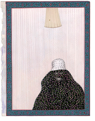
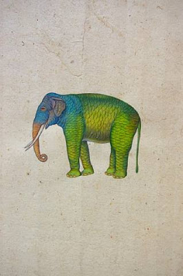
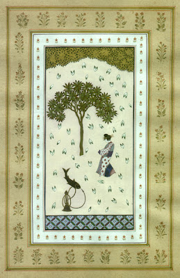
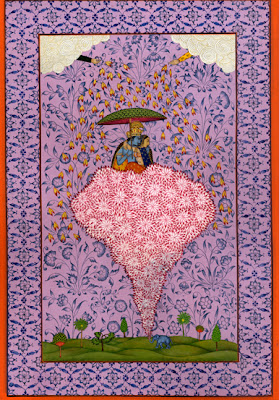
I apologize for being a bit off my game and not giving you an entry yesterday. I am in a funky state of progress and yet, no progress--work moving but not ahead, dinner cooked--but not "on". I feel a bit like the rubber ball that is thrown, hits a wall and rebounds to the left and right until returns to the thrower. Scrambled might be the word. Confused?
However, I was reading the holiday Elle Decor magazine and fell in love with this work. The images above are done by Alexander Gorlizki, an English artist, and Riyaz Uddin, a master Miniature painter in Jaipur, Rajasthan. They collaborate on images that take the miniature painting to entirely different and wonderful place. You can see their work (paintings, portraits, packaging and products at their website>> There are flying elephants and pashas riding fish. Funny sunfaces, exotica like high heels and flamingos mixed in with traditional figures and calligraphy. Of course, they had magnificent indian palettes and patterns--but some of these images also are rendered on a stark white field. A little breath of fresh air--and a little inspiration about cross fertilization amongst cultures and skills. Gets me going.
It is hot around here for winter. 40˚ going to maybe 60˚ with all of our snow melted and mud mucky. The gang is full bore on the carriage house push back. Mandy is here painting. Dare Daniels is done. And Jamie, electrician extrodinaire is finalizing the electrical piece. New garage doors (fakes for wooden ones that work from Genson in Skaneatalas ). So, by spring, the "door yard" of the house will look a little more polished and a lot less Appalachian, and may function a whole lot better--opening up the possibility of the kitchen and back of the house project that dovetails with it. As R proclaims, it really brings us much more "pride of place". Slow but sure though.
CA and Print entries need to happen. The SILA and SOI work needs to get out in the next week. New work with new clients need to get ramped up. Need to finalize things with the glass company...business stuff that is. Have already started looking for summer programs for K and A. Found an interesting week of training for Cross Country for A...and something else. Do they have a history of film making for eighth graders? (NOT). This truly is a labyrinth that wouldnt be so simple if it weren't for the good old internet.
Work awaits.
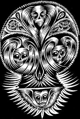
A friend of mine has a family member who is slowly dying of cancer and it makes me think a little about the process this stoic group is going through and ideas that have been spinning around in my head that I just want to get out.
As you know, I have been reading, looking and sketching about death and what it means--particularly with a focus on the Puritan view of death. It has been an engaging process to gather and store the symbols and traditions that have existed and evolved as a way for people to be helped to comprehend death without explaining why. I was struck by the Puritan view of death being a portal, a door into another place and not the end of life but a transition that we only understand until the person passes through into that unknown space, time, zone.
I have also been intrigued by the concept of the bodily remains, and the spirit (also called the "departed"). As our brain, the chemistry and memories are part of the remains--does this mean the spirit is "unintelligent"? Or is there an aspect of the brain, the energy, the memories, the personal essence that goes beyond the physical and is fused with the spirit?
We are by nature, delicate creatures. I am always startled by people dying due to an accident or a sudden shock to their system. This immediate action causes death, separating the body from the spirit and soul--quickly, shocking. A heart attack or immediate physical breakdown does the same. A physical jolt to crack the connection of the body and spirit. However, when someone is suffering, sick and slowly breaking down, the body is pulling away allowing the spirit space to depart. The person participates in the break down of the body, the shift of chemistry, the dessication of the physical to give the spirit the power to separate. There is tremendous power of life entering this world we know it and we have participated in the energy or power of the spirit departing to another life we cannot define and are questing to better understand.
From the Gannett News Service:
Wegmans Food Markets Inc. will stop selling cigarettes and other tobacco products beginning Feb. 10, spokeswoman Jo Natale said this morning.
Until that date, only remaining inventory will be available for sale and no new product will be ordered, she said.
In a letter to employees dated Jan. 7, Wegmans Chief Executive Officer Danny Wegman and his daughter, President Colleen Wegman, said the company decided to stop selling tobacco products mainly because Wegmans cares about its employees.
A smoking cessation program will be offered to employees this year, according to the letter.
“For those of you who smoke, we know it is very difficult to stop,” the letter says.
“But we also understand the destructive role smoking plays in health,” he said.
Tobacco is a very profitable category for Wegmans, Natale said, but did not provide specific numbers.
I was working on a project (a freebie) for the Trumansburg Music Boosters. The Boosters are a group of parents who help the music program financially and physically (feeding and preparing lunch for 1500 students for events etc)--and in return, they help fund music related expenses and programs. I figured versus me serving piles of sandwiches, my time would be better spent doing what I do--graphic design and illustration. Thus, teeshirts and logotypes. To get to my point, I was needing musical notation and many of the free sites (Dafont for example) did not have anything that really worked. I did discover that Mtthew Hindson, a composer working in Australia did..and HOW. So, if you need this sort of thing, I highly recommend this resource>>
New word. Loved it so much, I wanted to give to you too.
arcanum \ar-KAY-nuhm\, noun;
plural arcana \-nuh\:
1. A secret; a mystery.
2. Specialized or mysterious knowledge, language, or information that is not accessible to the average person (generally used in the plural).
Arcanum is from the Latin, from arcanus "closed, secret," from arca, "chest, box," from arcere, "to shut in."
example:
Here we must enter briefly into the technical arcana of employment law.
-- Paul F. Campos, JurismaniaThe Madness of American Law
Just a quick fyi:
Did you know that the New Yorker and Steve Brodner are doing some original work having to do with the election and the candidates? Brodner, author of Freedom Friesand tremendous political illustrator with The New Yorker, is in several short films on various political candidates with Brodner working on a white board and eraser peppering his illustration with political patter and his views. It is very light and clever--and highlights Steve Brodner's intelligence and historical knowledge of the insane political world. I respect Steve's annual blog entrys on Drawger as he manages to be pointed and yet not shrill or sharp. He is dead on.
Steve Brodner's Naked Campaign>>
Take a look.


After the recent blitz at all the surf and skate stores, mexican markets, japanese art shows and street art, the question poses itself: "where does all this skull and death imagery stem from? what drives it? where is the imagery from?". I originally thought that the inspiration was from the Day of the Dead imagery but the more exposure I got to this style, the more I came to understand that this imagery came from tattoos. Tattoos have spun these images and these images have taken the tattoos beyond the skin. Tattoo artists have been inspired by the images requested by their clients and the communities they come from--spanish, mexican, kar kulture, bikers, christian hard core, military. Originally people who got tattoos were either military or hard core (in the case of the general populace). Native cultures have great tattoos--but our American imagery comes from a very low brow, personal expression of community. Then when you think of the daily aesthetic that surround southern Californians, all sorts of exotica from the mix of cultures and influences which is alien to anyone other than S. Californians. And stir in a strong dose of all the military bases with people who have travelled all around the world and have commemorated events and people in their lives through marking their bodies permanently.
Tattoos drive the teeshirts where one can wear a tattoo on your clothes on top of the tattoos one has on one's body. Tattoos somehow make more sense in Southern California where it never gets too cold to surf, to skate or to wear sleeves--and the permanent tattoos somehow seem the most integrated with style, lifestyle and the focus on being outside, on the beach, on the street,in the sunlight. Tattoos are a form of clothing for some--a way of either expressing themselves and as a way of being distinct even in the surf. Tattoo artists are often lead the transition beyond the skin.
I was intrigued that Murakami began bringing skulls into his work with the happy flower image dropped into it's eyes. It seemed out of context with the rest of his work. The other skulls etc. except those in the mexican markets do not point to a statement about mortality or ancestor or any of the heavy mojo I am trying to bring to my stuff. Maybe I can give myself a little space to lighten up a bit. Maybe?
Read more about Ed Hardy, his team of artists and his studio, Tattoo City>>

A called it. The Tburg of our trip. Hermosa Beach. Everything within walking distance. Cool people. Cool stuff to do. Fabulous ocean and surfing. A place to settle in. We decided to spend our last two nights at the aforementioned Beach House. Well worth it. We are all scratching our heads about the crummy rating it has online. First off...It is fabulous. Why? 1. Its on the strand. 2.Rooms are great with a king sized bed, a queen fold away sofa, a for real fireplace, a mini kitchen, a bathroom with a jacuzzi and the works (including Aveda stuff), a balcony, a beautiful continental breakfast with fresh oranges and the best coffee yet with a view of the ocean and the passigiata, and a block from Hermosa Beach proper. It was great...worth the bit extra (they even had hot cider and cookies in the lobby all day!), near a rental place for umbrellas, surfboards, bikes, skateboards and lessons for all the above. R and A spent time at the Pier Surf Shop mixing it up with a very knowledgeable guy --self proclaimed surfer who explained the various long boards, skateboards, hamboards etc. complete with a very unselfconscious sales technique showing the foot over foot approach to how to deal with the boards and make them work for you. A. was all ears. R. was humorized. There was a huge stage etc. set up for New Years eve which promised to be amazing. We throughly enjoyed our stay oogling all the interesting people eating breakfast with us from Australians to Californians --older and younger. How did they find out about this oasis?
Olvera Street is a Mexican Street. I thought it would be absolutely the most touristi of tourist places. However, it was really for the Mexican and Mexican American Communities. I went there in search of color and skulls. I found them (and will do a sep. entry on them)--but, we had a great time looking at all the top line stuff for the quick shopper--like luchado masks, colorful mini guitars and accordians, fabric/embroidered stuff, and sweets. Day of the Dead stuff, skulls and the fabulous Virgin stuff was way back in the shops--forcing me to spend time to unearth them and the wonderful cut paper banners and paper decorations that we just dont have "back east". The other treasures were the decorated playing cards and lotterio sets. I know if I had done this with my friend Tina, we would have found the best...but hey. Research is research. We had great tacos and taquitos at a stand that were sublime.
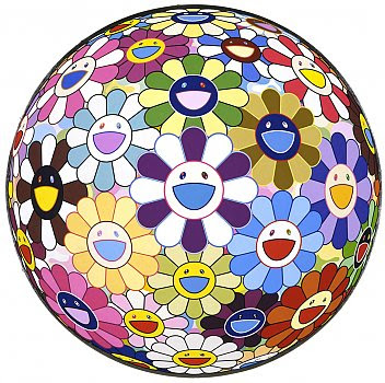
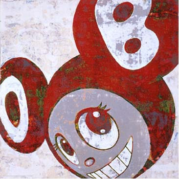
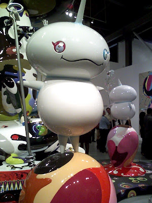
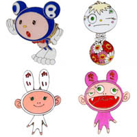
©Murakama
October 29,2007- February 11.2008
The Geffen Contemporary at MOCA
Takashi Murakami's show at MOCA is more than a show. It's a candy colored trip into the changing mind of a manga/anime inspired artist who is evolving his brand and art from a sexual anime form to that to me, that is more interesting--a fusion of pop art, the branding culture, eastern philosophy and imagery with that of japanese cuteness and palette. Sometimes its over the top cute, sometimes its headspinning "out there" which the context of the entire body of work grounds and to some degree begins to explain and provide the sources for the changes in the art. I mean, there are these painting that look like sticks of gum with random eyeballs and teeth that are arranged very much in the austere and precise world of Josef Muller Brockman, the swiss poster designer and proponent of the Swiss graphic design education of the seventies and eighties. Brockman would be on a rotisserie over this stuff.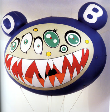
Murakami created the DOB character to express himself and act as a personal brand. DOB was his first image and brand--a brand that is used exclusively, and manipulated by size color and placement. DOB was best expressed in Murakama's blow up (huge) DOB heads and these almost Mickey Mouse type paintings that had a roughness-- a painted tie dyed quality that took it off his normal "Superflat" painting technique that defies the hand and could be screen printed or even better, cut vinyl. DOB evolved to Kaikai + Kiki (adorable little Mutt and Jeff characters who are rendered either front on or just their heads--in shades of hot pink and white). I first saw Kaikai and Kiki at Art Basel Miami at a Gallery--they were full sized fiberglass, painted figures--that were striking and funny. However, it was not knowing the context of the pieces that just made them a cute oddity like the trike D'zine did. They are, however, part of a much bigger idea. DOB was best expressed in Murakama's blow up (huge) DOB heads and these almost Mickey Mouse type paintings that had a roughness-- a painted tie dyed quality that took it off his normal "Superflat" painting technique that defies the hand and could be screen printed or even better, cut vinyl. His evolution to room sized, enormous, complex forms expressing both the anime, lessons from DOB and a new component, eastern religion and religious iconography. His Oval Buddha, 2007 has a duality of personality of his main character sitting atop a turtle complete with lotus details and leaves as part of the design. There are tiny figures plunging into and out of the head with a janus like quality--one face at rest, the other with it's mouth wide open with thousands of big conical teeth, layer upon layer of them much like a shark. As I toured around this figure (well over 5 meters tall according to Murakami in his Moca video)--more and more of the detail sunk in...This is an object and yes, an entire show well worth seeing for the first time to just settle into the aesthetic. Beyond that, I would visit at least two more times just to dig into the detail. If I were a starting artist, this show would change my palette and perspective on my art. It is noteworthy.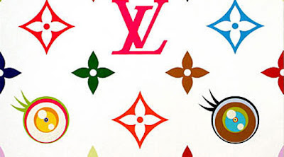
Beyond that, Murakami is also clever. His work is sold through his own venue--books, teeshirts, buttons, and plastic characters. Inexpensive stuff he marks up to the max. His work originally sold a trinkets sold with gum. Clever man--learning the non magic of how that happens. Beyond that, he has taken it way beyond the world of Kid Robot and into the collections of sincere art collectors. He took the Louis Vuitton pattern and monkeyed with the color and started tweaking it with his eye shapes, with happy cherries and a variety of his little visual icons. Marc Jacobs saw the work and now Louis Vuilton and Murakami are collaborating on some very expensive but very cute (say Asian cute!) bags and accessories. My favorite is a steamer trunk built with shelves and on those shelves are dozens of the same bag with the accent color changing...so essentially , it is a different (but the same) bag for every day of the month. Can you say KaChing?
I am inspired by this man, his work and will be curious to see how it evolves in the next decade as the money has been made, there are new works in film (the KaiKai + Kiki was at MOCA along with the new video done with Kayne West) and his visuals are expanding to take it to a more cerebral while pop inspired place.
Take a look at Murakami's films on the MOCA site to better understand the work and artist>>
Print Regional 2008
entries due: March 3,2008
online registration>>
Here are the pros: 1. Illustration category, 2.Max fee...meaning enter as much as you want or even do some cross entries for the jumbo price of $225.:
Please note the entry-fee cap of $225. Submit as many as you like (single entries, campaigns or series, or a combination of the two) but don't send more than $225. Any packaging entry, whether a single package or a family of packages, will be considered a single entry (fee $35). Any letterhead entry that consists of stationery, envelope, and business card will be considered a single entry (fee $35).
Its a good show and the publication is always interesting and more diverse than others. I am always thrilled to get something in...and they have an affinity for illustration to begin with. So get ready to go nuts!
____
Communication Arts
Illustration Annual
Deadline: March 8, 2008
more detail>>
Their FAQ is very informative and fleshes out who what where and when of the show. This is the grand daddy of the Design shows. Hardest (to my thinking) to get in. Who knows, cute sells.. maybe the Cornell Xmas card? The Chokers Poster? We will see? They might like a burka lady? Or the first Memento Mori book.
Work to do.
__