Back from Great Camp Sagamore for their annual fundraiser weekend. It was a lot of fun with some new twists (music at the dinner, an opening cocktail gathering, smores at the campfire and unscheduled downpour making the venue change from under a big white tent, to the dining room). All the new adds were wonderful, and I think our guests had a nice change, nice time, nice experience in the Adirondacks. It was a lively group of people we travelled with--who had ideas, things to say, things to contribute and who were engaged, fun and funny.
I am getting the hang of the NYS "silent auction" thing and am honing what I bring for impact and sales. My stationery box (remember the cigar box stuffed with stationery? that I contributed to the Museum Association auction?) got quite a bit of play as did the Farribault lap blanket (I bought a stack of them for a very (underline very) good price and though it sold for sub what the "real" retail price was, we got well in excess of 3x what I paid for it. So, the blanket thing sells too. Stylish nesting at the Adirondack camp is the idea....and all that surrounds that. Plus, with many of these summer people in a remote place, treats from civilization (liquor, wine, etc.) brought to them has appeal too. Plus, there is the quick $20. "I want it" thing...like the food jewels...or could be food too....I am thinking next year, some of the adirondack/ buffalo check inspired illustrations printed at 8 x10 and framed with a mat might work too. Phew.
I am full bore illustrating for the new opening of the Rongovian Embassy, a local institution that has a whole fake thing going with heraldic imagery, fake maps etc. which I am churning away on with my vector technique. I am not at full steam, full multitasking ability as I had prior to my fall...and am anxious to get that back as the volume of work I was doing isn't what's happening now to my frustration and to a degree sadness.
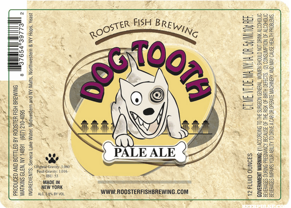
Former Roosterfish: Dogtooth Pale Ale.
I have finished an entire repositioning of the names/representation of Roosterfish Brewing. They have this sort of thing in the marketplace (see above) with much of their beer being marketed with tap handles and variety graphics applied to the handle. So I worked with the owner to move the brand from "crazy and off beat" to focusing on cool things that happen in Watkins and the Finger Lakes. Another thing that was immobile was the illustration of the fish and how to get it into a format that bumped up happily against other design elements without it appearing as odd as it is (Roosterfish are from only two southerly places and not from Seneca Lake--so it is rooted in the name sounding good and not on any meaning/symbology). The changed names of the beer reflect on things having to do with Watkins the place, the racetrack, the park and it's history. So, Dogtooth Pale Ale from Roosterfish (tough to remember) is changed to Finish LIne Pale Ale, and we have kept Firehouse Blonde but morphed the pinup illustration to a photo of one of the silver screen starlets who made movies in Ithaca and likely vacationed in the Glen. The owner wanted the take-away from drinking his beer to it being delicious--and so the secondary line of "drink deliciously" happened on all except Firehouse and a few more....I emphasized their being the first Farm Brewery on the carrier and six pack carrier... bringing all the elements across but keeping it predominantly black and white (with the second/varietal color only really happening on the bottle label.
The new imagery was going to be rolled out during Vintage Car weekend in the Glen but to the owner's happiness, the GREAT (yes it's part of the name) New York State Fair asked if they could sell six packs, so we are hustling to get this done two weeks earlier than planned (in about 2 weeks from today) to get it into the hands of the hoards that descend on Syracuse. I have done banners, coasters, table cards, tees in addition to the bottle label, six pack and carrier. My client has shown it to a big craft brewing distributer who is jumping for joy exclaiming that they can really sell "this". So, another lesson in good design sells and has value. And, it doesn't have to be fancy...just appealing, telling a story and approachable (at least in this case).
The fish got locked up in a circle and with a bolder (non handwriting font) in the way it is handled on the label, or centered without a circle (best is seen on the case). The big breakthrough (for a dummy) was to regularize the fish made it sync up with type, and become part of the element without it being THE feature. I was having a hard time living with the fish, making it work in context and being able to make it fuse with the type, and not compete with more illustration (as in the DogTooth) but having the type marry with photography works. I will share the program once it has rolled out. It would be wrong of me to give you the peek under the tent that the owner deserves to do.
And so it goes. The big, outer carriers need to be amended. Someone is coming to take my picture later this pm. so I should look for a comb to spruce up a bit. Believe me, I need way more than a comb.


