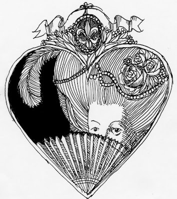
Here is another of the Marie Antoinette sketches. The heart shape works as a frame and device to develop the images in. I am thinking that the heart is used in 3 of the images having to do with her/her hair/ her person and a shield shape would be used for the other three. Gives a nice rhythm to the collection.
I've been messing around with the drawings in my sketchbook. Some of them I have scanned, brought into photoshop,amended, saved and brought into Illustrator. In Illustrator, I have used the demon tool, live trace, and then amended that image with cutting away and adding. Makes a pretty cool thing to happen. Refinements can happen live. The other thing is that I took the scan into Illustrator directly, and then totally redrw the image to good result too. Lots of editing at that level too. This line drawing thing is interesting as i can begin to apply some of the Memento Mori, Andy Warhol inspired coloration to this as see where it could go. I wonder if it would be okay (why shouldnt it) for me to take the 6 Marie Antoinette images and render them differently--some vector, some hand drawn, some a combo...and see what could evolve from this. It is a fluid working environment that could allow me to experiment with the imagery and the hand. I am feeling no confidence in both...so being able to mess with both imagery and rendering would be good. A protected playground...? This is where I need confidence so I can continue to do this outside of the world of academia.
Am printing 75 Chokers posters for July. Tweaking the colors rather hard to get more vibrancy than the original starting point. It has a granny smith apple background with some green and red hanging lanterns that need to pop. I think there might be three times through with the color on the Epson before we nail it. Speaking of Chokers, the Choker poster is coming back from the Society (had a very positive and happy exchange with Kate from the Society who was tremendously helpful and "can do").
Was googling my name to see where it popped up (which can always be curious)and found it on Zina Saunders page on Drawger. She mentioned the two people that shared her spread in Communications Arts. Her work is beautiful, luscious and very well crafted. I like her portraits and how she seems to capture the moment with the person she is depicting. Her use of unusual color, sometimes way too hot for the place she applies it...but it works is inspiring. Her writing is good, engrossing and also captures the beat, the moment of the picture.
It was so nice to be in such good company. The only troubling thing for me was the endless backslapping and praise that always happens with the Drawger posts. It is just so self feeding which as an illustrator I find amusing but insular and extremely clannish. As a graphic designer, I find repellent as it seems they all need each other, like self-help groups, to support their work. It does not communicate confidence or a level of professionalism. It seems so inside and so precious. I think I am just jealous of the folks on Drawger and how they are the "popular people" in our class of illustrators. I don't need to think. I am jealous. I really should be cool about this. Make a note: work on being cool. Oh, and did I say it? keep working and pushing it. This Communications Arts entry is the kick in the booty. Pretty select group.
Maybe my new eyes coming in this week. I wish this allergic, headachy lethargy would go away. Threatening more rain. its nice and cool. The grass is singing. It is perfect weather to grow.
