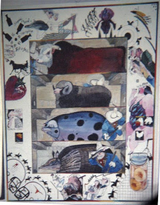
Basically, Jack Unruh preached the value of pursuit your bliss. Amen! Find what you like to do, find things that give you passion, find a life you enjoy and fuse them together. And he does. His signs for his garage sales (which sound like they are worth the trip as he has art too!)--are a "find the artist"/identify the artist poster that the winners get a $200 credit to the sale. Jack loves what he does, and it shows. My key take aways were related to his design--he uses silhouettes and detail in a very discriminating way--letting the places he cranks up the focus to take the punishment for the rest of the picture--allowing for white space; he uses handwriting and handlettering to be part of his design (I should stop shrinking from that...I do have that in my quiver and have kept it there); He designs his borders and backgrounds to tell part of the story--but it seems they are considered as separate elements (in some cases) shifting the perspective, size relationships and placement to suit the design; and to consider the relationships of things (use scale, placement and added elements to help tell the story); enhance the story (or add to the story). Sometimes he just literally tells the story and zips it up with his color/detail focus or sometimes he puts his Jack Unruh spin on it.
As with all of the illustrators of this week, Jack is an absolute peach and home run. However, in his case and that of Ray-Mel Cornelius, there are solid take aways/ things I have been intrigued by that I want to start working with relative to my work. And for that, I am grateful to have been given the chance to come by the gracious Tinklemans for inviting me to come to Fort Worth as a preview of the fun to come.
