Yesterday was filled with art, head spinning art, design, cool stuff and books. It had friends--old and new, friends we bumped into and just being friends (Q&R). It was, as mostly, a perfect Miami day with sun, a bit of humidity and clouds, but few. We started at the Convention Center to be there when the doors opened by noon--and we could only do about 2 and a half hours before both of our heads were buzzing, and eyes ringing. I did a solid five hours last year by myself--where I was going deep, taking notes about everything and not having as social and pleasant as it was with R. It was more like work--looking, seeking, comparing for ideas, approaches and confirmation with the death stuff I was on. It was also my November school get away as I was neither at Hartford or Syracuse. This year, stimulation is not as craved as I have plenty from all corners...so I was there to scoop up bits, see some trends, exclaim over the funny, profane or amazing. That was my goal. So, what did we see that was great:
Sparkles. They are everywhere. Applied to 2D stuff. Sequinned and rhinestoned 3 D stuff (I think triggered by Damien Hirst's Diamond encrusted skull)--from antlers, to strings of glittery glimmer to, diamond studded teeth in mink encased in lucite...Everywhere. Somehow signalling the end of the fat times--or maybe just the exclamation point before the fog of recession settles in.
Antlers: Everywhere.
symbols of consumption: Chanel double Cs, golden guns, exotic animal prints, gold plate everything. Very Paris Hilton, or Phat in the styling. I find it repulsive and not funny, but I think some think its funny. I think it is sadly telling about our culture.
Artists I saw and Loved:
R. Crumb drawings of Aline. Funny but somehow poingnant out of the R. Crumb spinning tale graphic novel approached.
Alex Cerveny's watercolors and small paintings using beautiful gradients, a consistent thin warm red border around his works. Lots of floating heads, twisting people and imagery that reflected a real understanding of medieval manuscripts. He used type on his images, sometimes creating halos with words. Beautiful florals. He is represented by Casa Triangulo, Sao Paolo, Brazil.
Alice Neels's painting of James Hunter Black Draftee, 1965 was startling and beautiful. Neel masterfully, and simply sketched the whole seated figure on a light neutral field and then went about painting the face boldly. This piece was breathtaking.
Steven Conroy's work shown through the Marleborough Gallery stopped me dead. His painting of JKIII, 2008 was a strong, simple portrait that was commanding in the confidence Conroy shows in the way he handles his paint--socking in the big stuff and then boldly using a dark line to delineate areas. Felt very Leindecker in its huge scale, simple blocking and tackling, memorable. I need to see more of Conroy's painting as it is masterful and was a teaching image for me.
Big year for Botero in numerous galleries. There was a lovely sculpture of a man astride a horse in a stone that sparked making the sculpture look as if the equestrian and horse were carved crisply out of a block of sugar. Since his work he did on Guantanemo that we saw a few falls back at the Marleborough Gallery, I found I loved him for his work and his thinking. Prior to that, I loved him for his approach, style and sweetness. He is back to sweetness with many new images being chubby acrobats, women riding horses in the circus, clowns (Comedia Del'Arte inspired versus "bring in the clowns" clowns). Very inspired by the work of Picasso. What was intriguing beyond the paintings which are looser...are his simple line drawings he tinted lightly with watercolor. I took notes. I can do this. And it looked good...snapped up some relatively ordinary drawings.
Russian artist, Stas Volyazlovsky's Magic Mirror was drawn on tea stained fabric> some of them looking like old runners with lace on the end, drawn with black and blue ballpoints. The style was very informed by russian tattoos or even street art. Volyazlovsky parodied religious and political theme weaving crowns, and symbols for the devil in with portraits of George Bush and Hitler, linking the Oscars with the Oskars--marrying western and eastern language and type forms....amazing.
Kehinde Wiley's portrait of Luis Carlos Neves Reis Study II,2008--oil wash on paper was outstanding. His portrait was bold, big (head must have easily been 18" tall) with flat fabric patterns behind and in front. Chad G. would have loved.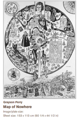
Greyson Perry's Map to Nowhere at the Paragon Press is a showstopper. It is a big engraving (pieced together), an edition of 15 with all sorts of religious, anatomical, political, geographic symbology with wonderful hand lettering saying the funniest and sobering things all together chock full of meanings and messages that only viewing it can accomplish.
Book Notes:
Taschen was there. These are keepers by Taschen:
Illustration Now (people to research later>>Ben Goss, Olaf Hajek, Christoph Nieman, Jordin Isip, Jody Hewgill, Melinda Beck, Craig Frazier)
Graphic Design Now
Wiener Werstatte
Guidelines for Online Success
Circus
Visionaire was there. Visionnaire does art projects with artists. To see more>>
Art Metro was there with books on Matt Leines (of Juxtapoz fame) for one. Also hade a series of books written by Hans Ulricch Obrist on artists (R Crumb interview for one.)
Art Book.com: a tremendous resource.
Then we went back to Design Miami and walked the Design Miami Pavillion. I need to take a moment and talk about the real hit of the show, the lighting. There is this very intense highly focused lighting that is the rage. I went into a gallery with a bunch of Hans Arp drawings and small paintings and the talk in the room after the gasps was not about the art, but the framing projectors used and the intensity of the light used. Same in the Design Miami Pavillion that featured an opulent Audi with these impressive lights focused on it. Made 3 D seem dull.
There was a ton to see at Design Miami--actually surprisingly refreshing from the din and sheer volume of art from the Convention Center. Standouts were books, a splashy single chandelier that changed color from Swarovski--very Las Vegas, very Celebrity Cruises--and in the context of a big white space, kind of funny and sweet in the showgirl brazeness it has.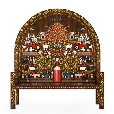
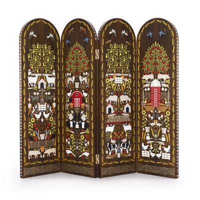
designer: Studio Job
2008
manufacturer: Studio Job, The Netherlands
materials: marquetry in natural Indian Rosewood with iconography in dyed African Koto, Pama, Tulipwood, Ash, Bird's Eye Maple, Aningeria, Madrona Burl, Birch and Red Gum
exclusive to Moss produced in a limited edition of 6 pieces
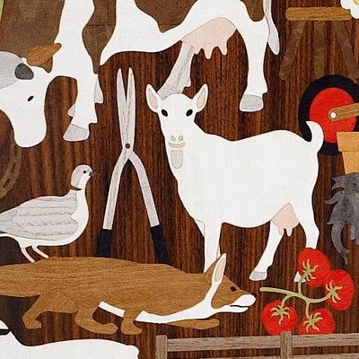
However, I almost passed out from the "Bavaria" collection of work Murray Moss had on show from Studio Job. It was the battlecry for all of us decorative illustrators waiting for new things to do! Marquetry on simple benches, tables, cabinets, mirrors using imagery near and dear to the members of Studio Job, the dutch life of farming. Symmetry, color, flat tones, a sweet story that any grown up or child would embrace. Among all the sophistry and chic, these whimsical illustrations were in your face, demanding (as with the Sheik of Chic) you pay attention, and while you are at it, be charmed. This collection of furniture came out of bigger farm based project called, "Farm". Now, could I live with this stuff? probably not. But, its a wonderful world that we can know that this sort of work is commissioned and sold to those who are as charmed as I am.
We had a nice sit and a drink in the HSBC lounge (for those with the right badges)--in an environment created by the Campana brothers, sort of a tiki chic thing with winding benches with rattan knit pillows and the Campanas loopy red chairs. There was a video extolling the Campanas and there as we were sipping or cool ones, strode the men themselves, the Campanas, celebs there to meet friends and have their pictures taken. We later saw the Campanas at Al-Sabah 's posing with the al Sabah himself. Al Sabah had moved some furniture as many of the pieces we saw on Friday were replaced with new ones...and he had lovely women in arab garb, more men in the same with plates of falafel, and inlaid boxes open with pieces of baklavah and other treats being offered about. More gigantic pyramids of dates, and dishes of pistachios.
It was fun seeing Tim Dubitsky work on with the GlassLab team to create 2 tattoos three dimensionally (one a flaming heart with a dagger, the other a sword with a rose) that were truly tour de forces to create on site (from blowing to at bench flameworking) to putting a significant number of truly developed forms onto one piece without thermal shock. Impressive. And, the pieces were remarkable too. This all ended around 9:30.
We strolled down the street (amazingly developed since last year this time) walking by Genius Jones (a great kids store) and no end to kitchen supply, tile supply, furniture and gallery shops to Pacific Time, a restaurant you need to pencil in for dinner the next time you come to Miami. Chef and owner, Jonathan Eismann is married to an old friend of the Cassettis so we needed to go and support the team and see this wonderous place. Pacific Time was a buzz--every table filled, all ages, sizes and shapes...turning tables and taking another seating even at ten. We had fish and wonderful sides of eggplant and another of swiss chard which made me consider being a vegan might not be the hardest thing to do. The real deal is to do as our knowlegable neighbors did which was to have the "whole shebang"-- one of every "small plate" offering that have to share for the table. Watching this go down was like really getting a visual and smell based review of the menu. From what I saw and sniffed...everything was beautiful, imaginative and distinct not to mention amazing.
Must go, the day is getting away from me.
