Its that time of the year, the day before the day before a holiday. Always that moment, that day when the corporate world explodes/implodes and we are there with open phone lines, sharp pencils and multitaskability to help them all to get out of the office for their breaks which sometimes manifests itself in my not having a very happy holiday (read working). We are holding steady. Eleventh hour, we need to see this, then, now...and then...A bit of hair ripping. But, I am typing this while the postscript files are saved out.
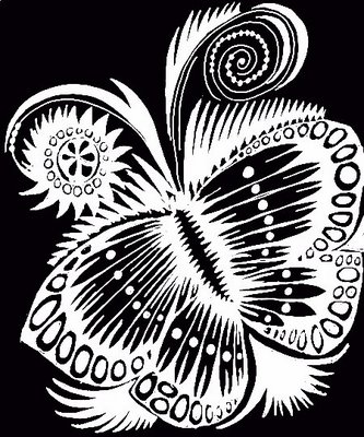
Had a mind bending conversation (all positive) with mentor Murray. He got on the phone and had all sorts of ideas, input and excitement around the image that was posted last Friday ("IF: [Homer's] Opinion).He was so encouraging, so positive, so delighted with this piece--suggesting I get paints out and tint output on watercolor paper. It was such a blast of postivity, my hair hasn't flattened out yet...and I am a bit stunned...trying to get some time tomorrow to output the image and play with color a bit..He wants a bit more of this...and I have been working on the Genesis stuff with a whale that is moving someplace...so it sounds like parallel universes with genesis and fluffy ladies. I have the genesis corrections from NYC (eliminating the goofy white lines that separate the tree from the background, the owl from the background and shifting the background color) and now I need to go here too. No problem. Every step Murray pulls me forward--and the work improves and I keep learning. I keep taking in the conventions as I look and listen to this wonderful educator, kind man and incisive art director and guide. My hubbie is pretty good at this too. But I fight R. I am not allowed to fight Murray (I have almost given up--what will he do?) and each and every thing has value to me. I suggested Dennis Nolan's palette and he suggested John Alcorn's palette. So, Alcorn it is. We will see what happens.
I have been looking at Leo and Diane Dillon's Bradley, Will Bradley, William Morris and Walter Crane. There are some other conventions that come out about illustrating--the ones Murray has pointed up are, to refresh myself:
> women have light and delicate features. minimize or eliminate shadows.
> women have light mouths--do not draw the bottom lip, but suggest it with the shadow under the lip.
> all elements that move away from a trunk or a torso taper (read, arms/legs or branches or octopus tentacles even flower stems...its a good one)
> new understandings:
--sometimes women have tiny, bitsy hands and feet.
--sometimes the figures are almost graphic shapes with the background and foliage doing all the business with the detail insanity. The sheer relief of the plain figure is remarkable and becomes the first thing the eye sees.
--edit while you draw. More is less.
--keep the pen moving and if you worry, photoshop also can erase and edit..
--think dark and light with the page patterning with figures and foliage.
--faces are always almost calligraphic in simplicity. No need to whale on it. Brief for male faces, scanty with women.
Gotta go. Some postscript files are crying.
