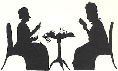
I have been thinking a lot about how to make type bump up against my illustrations better. My mentor and teacher, Professor Arnold Bank, known for his singular and definite opinions on things had a dictate. You make your letters with the same tool you do the illustration with. So, pencil drawing, pencil lettering. Music pen lettering>>music pen drawing and so on. How this parlays to type is another thing...unless the illlustrations are like chapbook illustrations or even silhouettes --black and blocky--then black and blocky be the type. If the type is elegant and refined, inspired by the romans, drawn by the angels, elegant line drawings suffice.
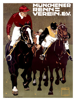
However, the type just looks "stuck there". I do admire the way Ludwig Hohlwein integrates and designs the type or in some cases a wonderful hand-drawn script with his work. It seems to flow better with the illustration--incorporating the two versus the whole heres the image and here's the type. This is where the men and boys are distinguished. This takes skill. Bernhart isnt shy either. Nor is Julian Klinger, another poster designer in the early part of the 1900s. Maybe it's because the illustration is more graphic, more amenable to being married to type. 
Poster by Ludwig Hohlwein.
Another thought I had the other day was the typographer/designer that is in me needs to take a break. I was randomly drawing some letters for the Happy Healthy Holiday card in a kind of wack job, highly illegible way--think lines broken up with dots and curves etc and all smashed together using a single line pen (a la Steinberg)--having it come out in a Book of Kells-y on crack look. I scanned it into photoshop and randomly began to color it. Interesting process. The result was relatively cool and not in any way pure typography. Maybe the way to crack this typography nut is to forget (or put the pause button on) and try to be more in the world of "automatic drawing" and see what evolves. The less planning, the better.
Illustration Friday entry next...?
