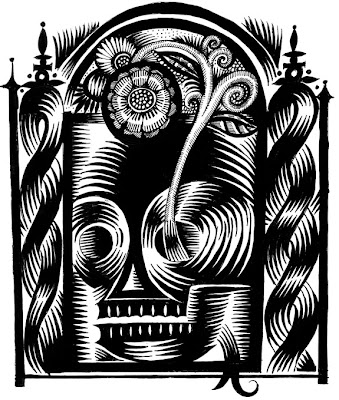
Lulu book in my hands. Now the amendments happen. The blacks are really nice and rich (probably as it is designed for the all text books)...almost matte. The tones hold up if they happen in photoshop. If there are tones created in InDesign--they are a soft black but certainly not the specific tones that are in the art. I am glad I did this sample as it shows me which crossovers work, what truly is the "active area", and an opportunity to check the sizes of things. Overall, it looks great, but I need to size down several of the images, plan in more black pages (in the next book), more linework and diversity of images, Plans in place to run the job twice the next time as a sample...one as a full color black and white, the other in this black and white mode. Another plan is to create a sample book using a variety of images, crops, placements, type and size to really understand the medium better. Even with clean inked drawings, because this is digital output --there is a tiny jagginess visible (if you really scrutinize) which might go with the territory and may work better with pictures or images that are not so stark and singular as black and white line work.
Don't get me wrong. I am thrilled with all of this. Just need to better understand all of this.
