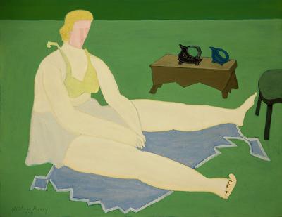
 Whoa. Time has gotten out of hand. Much goings on here. Working on some stuff for a premium crystal company. Some pattern design, some big 3D ideas--Christmas(the dreaded December holiday), animals and some "nostalgic" derived ideas...illustration focused. Should be fun. Have been looking at the work of Milton Avery, poster design in general and asian art. Love Mr. Avery. Big blocky ideas and very beautiful, almost Vuillard type compositions and use of texture/pattern.
  He is referred to as the American Matisse, but the whimsy of Matisse's cut paper work--and the total two dimensional approach doesnt really align well with Avery. Mr. Avery will work in these lovely flat areas, dropping in pattern, working the shape as a shape--but rendering each shape as a beautiful object (versus Matisse's almost manic cutting jobs...take a look at how the shapes are chopped out...laid on top of other shapes...adobe illustrator would have been his new tool of choice!)--and sometimes whimsically dropping in a shadow on top of a shoe or something. You could group ole Tom Purvis (British poster designer--did a lot of work for the British Rail System), Matisse, and Mr. Avery together and do a for real compare and contrast and it might be really interesting.
