The Taller Grafica Popular


Do you all know anything about The Taller de Grafica Popular?

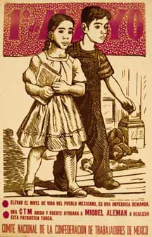
The Taller Editorial de Gráfica Popular was founded on the dissolution of the plastic arts section of the Liga de Escritores y Artistas Revolucionarios in 1937. The Studio had several locations in Mexico City throughout its history. At first it tried to work as both a publisher and gallery, but was ultimately inclined towards printmaking. The TGP artists grew up during what would become the 20th century chapter of the Mexican Revolution (1910-1940), and almost all the members of the TGP belonged to the Communist Party. Much of their work was addressed to working people and dealt with social issues. The TGP produced posters, billboards, and graphics in a variety of media. Their placed graphic art in a special place within the history of Mexican art. The TGP ended their activities in 1977. From Historia mínima del arte mexicano del siglo XX.

>Here's a great site>>


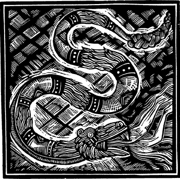
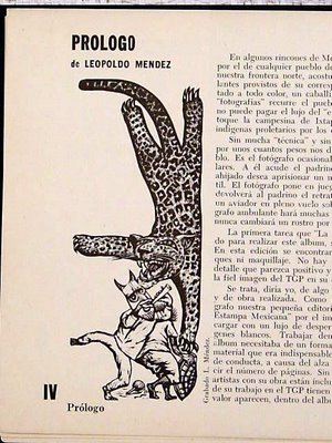
The work of Posado, Manila and Leopoldo Mendez* really speak to me in their content and use of black and white. Lessons in this work. Their artistic successor to my thinking is Artemio Rodriguez (noted last week). Powerful, masterful, brawny work that extudes confidence in the fluidity of content, scale and approach. These guys are a sidebar to this world of art...and hidden from those of us east coasters. I am finding that I am back on track with my thesis as I was getting a brain freeze--and now its fluid and the fear has fled again.I was getting all hung up in fine tuning that I started to freeze my work and not be able to move it off center. However, thanks to a ballpoint pen, I started thumbnailing on the plane and now I am back to dreaming of images and planning out how to do them...Plus, look at Mendez's snakes. What is not to getting jazzed from this wild stuff?

* Leopoldo Méndez is considered among the best of Mexico's Twentieth Century graphic artists. He was a founder and long-time member (1937-1962) of the Taller de Grafica Popular (Workshop for Popular Graphic Arts) in Mexico City. Méndez is known for his powerful images and contrast of light and darkness, usually through the medium of linoleum cuts. He helped, along with Jean Charlot and other TGP artists, to revive and build upon the artistic legacy of Jose Guadalupe Posada.

Posada and potatoes


I am musing over the Mexican woodcuts and their artists/graphic designers such as the grandddaddy of this group of people, the artist Posada (José Guadalupe Posada (2 February 1852 – 20 January 1913) was a Mexican engraver and illustrator.) and peer, Manuel Manila. In the meanwhile, I am boiling some potatoes with some milk to make a pan of les pommes de terres dauphinoise as my big effort for today. I have taken it way too easy (lying abed entrance by an airport book, People of the Picture by Geraldine Brooks)and am not shifting out of that as interesting thoughts happen when you just forget to think. Thoughts like my thesis, work in general, the concept of the bodies of work and the amusing "luxury" genre and how that has shifted the paradigm for retail, hotel, vacations/cruises...and how I should approach this new shift in my work. I even have a pretty sweet idea for the Baker Institute Annual Report that is green, cheap and really original--inspired by the little I have been learning from the land of Zines. So I plan to float and flitter today and see what emerges from this state because reality is only 15 hours away.

Musing about Gainsborough spurred by Blue Boy


From the Huntington Art Gallery:
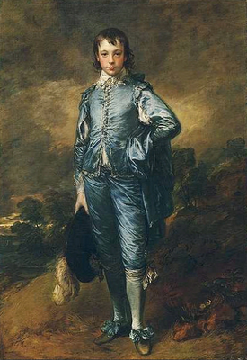
Jonathan Buttall: The Blue Boy (c 1770)
Thomas Gainsborough (1727-88)
oil on canvas, 70 5/8 x 48 3/4 inches

The best known painting at the Huntington, Gainsborough's The Blue Boy, portrays Jonathan Buttall, the son of a successful hardware merchant, who was a close friend of the artist. The work was executed during Gainsborough's extended stay in Bath before he finally settled in London in 1774.

The artist has dressed the young man in a costume dating from about 140 years before the portrait was painted. This type of costume was familiar through the portraits of the great Flemish painter, Anthony van Dyck (1559-1641), who was resident in England during the early 17th century. Gainsborough greatly admired the work of Van Dyck and seems to have conceived The Blue Boy as an act of homage to that master.

The cool thing about this painting is that Gainsborough used this painting to showcase his ability to paint something more than what he was being hired to paint (the ladies in the white dresses a bit off center with very sketchy backgrounds and to my thinking, some fairly simple and quiet lighting solutions. This was a piece to raise the bar and say, "hey, I can do this too!".

Wiki illuminates an aspect of the story:
It was often rumored that Gainsborough painted the portrait in response to rival Joshua Reynolds,who had once written:

It ought, in my opinion, to be indispensably observed, that the masses of light in a picture be always of a warm, mellow colour, yellow, red, or the green colours be kept almost entirely out of these masses, and be used only to support or set off these warm colours; and for this purpose, a small proportion of cold colour will be sufficient. Let this conduct be reversed: let the light be cold, and the surrounding colour warm, as we often see in the works of the Roman and Florentine painters, and it will be out of the power of art, even in the hands of Rubens and Titian, to make a picture splendid and harmonious.
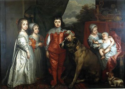
The children of King Charles I of England in 1637 by Van Dyck. From left: Mary, James - unbreeched at four, Charles, Elizabeth and Anne.

So, Blue Boy was a sample. And what a sample to observe up close, the way the satin is rendered in all manner of color and brushwork. I wonder if it helped to move his work with the clientele? I wonder if it made his peers gasp! and applaud his ability to shift his work this way.

My great surprise, my gasp is that this is the same Gainsborough painted one of my favorite English paintings--Mr and Mrs. Andrews. This painting was early in his career allowing him to showcase his love and abilities with the landscape. This painting depicts a pair of newly weds and the property that Mr. Andrews owned cojoined with then new property that became his upon his marriage to the fair Frances Carter of Ballingdon House. It was painted in November, a time of harvest and visual plenty which perhaps linked to the marriage and it's wealth (?).

I love Gainsborough's children's bookie exaggeration, the use of color and placement on the canvas. This picture flopped would make a perfect bookjacket cover for an english romp--I love the "whatch looking at" face that Mrs. Andrews calmly presents to us, and the relaxed manner of the man of the household. The dog is asking for something to do. And the Missus is thinking, "goodness, I wish I could get some shoes that fit, these tiny things pinch". Plus, she is painting a picture on her lap. Have you ever been able to do that without a hard surface underneath? The National Gallery site suggests the painting would have been a placeholder for the baby to come. Huh..?

These are the Gainsborough's I love...less the court paintings (which as a category, I adore...but I am easily humored). These little english tales as rendered by a storyteller painter in a spare english palette of pinks and blues. This is the England of literature and private, spare romance. This is the sweet England of the happy rich who revel in " a longish walk", who hunt and love their dogs, and cultivated ladies--who as articulated by Jane Austen (50 years earlier--but true to the english essence) in her book Pride and Prejudice on the accomplishments of ladies:

``It is amazing to me,'' said Bingley, ``how young ladies can have patience to be so very accomplished as they all are.''

``All young ladies accomplished! My dear Charles, what do you mean?''

``Yes all of them, I think. They all paint tables, cover screens, and net purses. I scarcely know any one who cannot do all this, and I am sure I never heard a young lady spoken of for the first time, without being informed that she was very accomplished.''

``Your list of the common extent of accomplishments,'' said Darcy, ``has too much truth. The word is applied to many a woman who deserves it no otherwise than by netting a purse, or covering a skreen. But I am very far from agreeing with you in your estimation of ladies in general. I cannot boast of knowing more than half a dozen, in the whole range of my acquaintance, that are really accomplished.''

``Nor I, I am sure,'' said Miss Bingley.

``Then,'' observed Elizabeth, ``you must comprehend a great deal in your idea of an accomplished women.''

``Yes; I do comprehend a great deal in it.''

``Oh! certainly,'' cried his faithful assistant, ``no one can be really esteemed accomplished, who does not greatly surpass what is usually met with. A woman must have a thorough knowledge of music, singing, drawing, dancing, and the modern languages, to deserve the word; and besides all this, she must possess a certain something in her air and manner of walking, the tone of her voice, her address and expressions, or the word will be but half deserved.''

``All this she must possess,'' added Darcy, ``and to all this she must yet add something more substantial, in the improvement of her mind by extensive reading.''

``I am no longer surprised at your knowing only six accomplished women. I rather wonder now at your knowing any.''

This is the climate of English perfection these storybook paintings can be derivative of...the character studies, the manners and cultivation of the quiet, country wealthy that charms me as they link so much to the world of Jane Austen, Mrs. Gaskill (Wives and Daughters). The stories
as depicted by Gainsborough are more informed by the world he lived in (he married an illegitimate daughter of a member of the aristocracy who settled 200 pounds per annum on her at her marriage). In the context of Jane Austen, 100 pounds per year was what Mr. Bingley had settled on him in Pride and Prejudice. He could live well without working and support a wife, his sisters in a large manor house. So, Gainsborough didn't need to paint to pay the bills--and with that, it gave him the entree to that upper crust world that many of his portraits of the Royals portray.

Interesting to think about. And, don't quit the day job confirmation--either that, or marry well.
I need to go and work on my accomplishments. Walking with a certain air, today? or should I cover screens and net bags?

Mr and Mrs Andrews

about 1750

National Gallery of Art, London


John Plampin.
About 1753-4.
Oil on canvas.
National Gallery, London, UK
Home at last


Mixup leaving LA (scheduled the ticket for 11 and remembered it as 11 though the time changed to 9 a.m.--and didnt reconfirm....bad me) so we got off later and then had to spend the night in Philadelphia versus our other choice, the red eye (no thanks). So we killed an hour or two at the Theme Building--the former air traffic control building now restaurant. After a whole retro week of seventies, sixties and otherwise, it was dead on and very interesting. The restoration looks pretty bang up--so hopefully we will see a "new and improved the next visit. The next visit Rob proclaims must be soon as I just found out that I got 4 pieces in the Society of Illustrators West Coast show. Those pieces are the newest raven, the boston terrier with the green background, the Glimmerglass wine labels and the willow head that just got into Society of Illustrators NYC.


We spent the night last night in Philadelphia at a Four Points by Sheraton--having a drink at Sheraton's newest, a Loft hotel (the commercialization of the Boutique Hotel approach we just experienced at the Palomar (Kimpton) and the Standard Hotel (Downtown). This morning we ran the gauntlet at Phl with the bagcheckitis, and then the gate to Gate F complete with the vomit inducing busride to the remote gate (which we tried to walk to and was chided as we would have to go through security yet another time). R calmly chalked it up to just being Philadelphia. I was losing it.

Now back to the previous day. We spent the bulk of New Years Eve Day in Pasadena after breakfasting on sushi at another one of those fun Famima stores. We jumped in the car and from downtown was in Pasadena in about thirty minutes. It was a perfect thing to do. The Huntington has wonderful galleries (if you like english painting> a la Gainsborough, Reynolds, Romney and the like you are in for a treat). Their best known paintings are Pinkie and Blue Boy. We got a dose of that which was amusing as I could make K and A laugh talking about the paintings and doing a little comparative discussion about compostion, approach etc. And, they actually were paying attention! We looked at drapery, composition, color, brushwork and tightness of the painting, what the light was doing and how it was telling us something (or was it). It was great.


K and I found ourselves in heaven first seeing cartoons and then the final Bourne-Jones stained glass window for the family chapel (created by the William Morris Studio) to find at the top of the stairs a gallery with great examples from Walter Crane (Peacock), William Morris (fabrics including the Strawberry Thief) and some tile examples of the same period and an amazing library case of the same style/thinking. We had to be dragged out. (I was threatening to kick and scream but the gardens are so great). We took in a small but very dense show about the Green and Green brothers architecture with plans, line drawings for details and decoration combined with custom decorative arts and furniture created for these houses. I found the work (15 years later) a bit more ponderous than before and I wasn't as delighted as the first time.


Then to the Children's Garden at the Huntington. My goodness! They spent a ton of money.  But as you know, you can spend a ton of money and have something stupid or spend a ton of money and have magic. The Huntington Children's garden is absolutely sublime as it is all very high level, very respectful of children and how they play--not the usual crappiness  that many of these places have where it is more about adults thinking about what kids would like versus what they really like. The water elements are designed among and through the garden with mazes, full sized topiary buildings (with even furniture elements being topiary) complete with growy windowboxes, doors, windows, and surrounded by other tiny topiary. Every touch is delicate from masses of blue plants, to these wonderful little pots of all heights filled with water and some with sculptural koi inside them. These pots were placed strategically by a hole in the ground that would shoot a single bullet of water into the air which would land with a plop into the vessel next to them. So there were littles playing in the water, surprised by the little water shot...or littles trying to catch the water.... There was a room made of hedges that surrounded a semi circle of black columns which intermittantly would fill with mist that K and A likened to being in a cloud. Now, K and A are 16 and 15, cynical, wisenheimer kids who were as charmed as the 4 year olds (maybe even more so)-- There were all sorts of fruit and flowers from roses and rosemary to pomegranates, lemons and oranges. And the world of the chlldren's garden was a new day of living in and with nature for all ages. Truly, we could have spent the day experiencing the mist, the little popping pools, the topiary and the vibrating fountain that made our fingers tingle. We could have touched the succulents, engaged the silly fat bottomed palms, and the feathery grassy enclosures that changes the world and the way you see it. The traditional, beaux arts/ versailles inspired gardens are awe inspiring--but this world for the young inspires awe in the simple and magical.


The (new for us) expanded Japanese gardens are spectacular with bridges and ponds filled with enormous, happy koi with graceful, "real thing" japanese buildings and stone sculpture. The snacks (japanese dumplings, japanese candy and dried squid, and no end to interesting teas) are sold from a graceful wooden japanese tea building that was awesome in it's design, producttion and the lovely courtyards (paved with stones on end much like patterns you make with beans). These were some small selections from all the wonderful things we saw--and the collection of reference builds! I am thinking the garden of eden in context to all of this. We had to leave around 3 to have lunch (at the"Best" according to Team Cassetti)-- The fabulous In and Out Burger!

They have a simple menu: Hamburgers, Cheeseburgers, something called a double double, fresh made french fries, shakes and sodas. Thats it. The burgers are just the right size, not the ginormous ones that the big boys put out--and they are sublime. A waxes romantic as these things are devoured. We love the foood down to how the sandwiches are wrapped (and at the restaurant served on these cute plastic trays). People were buying paper boxes of these things with big bags of the fries hustling out the door to get the food to their friends as fast as possible. We always ask ourselves why we go anywhere else because these burgers are the top of the culinary heap (though now that I am shack centric that may change!).

Then, off to Palos Verdes to the High School to meet " the twins",, Devon and Jenna who wanted to do a glass demonstration for us and show off their wonderful teacher and the shop they have. Amazing all the way around. I want to go to High School with these driven sisters who are funny, opinionated and quite skilled. If this is the future, bring it on!!

Pizza and family New Years Eve with me being in bed around 10. Couldn't keep my eyes open--with the youngers hanging with Gloria and Jenna until a bit later. It was a wonderful day.