wheeeeeeeee!


I was tromping across the quadrangle from "the building with it's own cell phone tower" (and banking machine), dragging no end of stuff (notebooks, one million pens, and the usual) and was struck with what a nice day it was. So, I took pictures as I walked and the image above is what this crazy "camera" can do on the fantabulous iPhone. Takes a bit of getting used to, but this is a very nice tool for the weakminded and scattered such as yours truly. Looks a bit Danny Yagmin-eque? don't you think?

Big nice news. We were invited to have lunch at the 1877 club, a white tablecloth, light wood, cushy chairs, light filled dining room that has a fresh buffet for around $10 a pop. The sheer volume of white flour and sugar presented for dessert is overwhelming and my classmates are loving it (I have to admit that it holds no thrall over me...). But the salads and soups are lovely and non institutional--so it truly is an oasis for the tired and stunned such as ourselves. This is no Syracuse! Nice facilities, really nice people, great working spaces, plenty of plug-ins, epson printers, lets not forget :AIR CONDITIONING, a cool dorm for grown ups and the traditional Tinkelman special: great teachers, great students, great alumni. Worth every hour, worth every cent. Need to go into this further, but it 6:23 and I need to move.

We also just discovered a cool coffee shop (with great coffee and derivatives) in the lobby of the library. How spoiled we are! No reason to go to the cafe in the lesser Student Union. Should be fun!

More later, coffee and clean clothes await!

The Round People and The Flat People


I have to admit it...I am tired. Tired when I go to bed, tired when I wake up. I may just take a bit of a break tonight, drink some water and go to bed early. Truly, I feel like I have been dragged through a keyhole backwards. But, prior to my date with my pillow, I figure I will give you a short one, two, three of today.

Once again, Vin Di Fate was fascinating. We reviewed the Romance genre this morning and Action/Adventure this afternoon. Vin moves pretty quickly, weaving ideas, approaches, context and style into a fluid hour that whizzes by. The classic guys just make me constantly check on whether I am breathing. That Coby, John and Al are such amazing guys. I love the flat color, the simple compositions using architectural elements or aspects of the picture to help do the work. Parker really knows how to use the page--employing the fade away as well (or better than Cole Philips). Seeing Mark English again was a blast from the past...and it reminded me of how much I like his work. And the tone-y, chic Joe Bowler work that really is like opening the windows into yesterday--so beautiful and sensitive that it is illustration poetry. The Queen of the bodice rippers, Elaine Duillo is an amazing illustrators--the pure center for the work we see today on the peggyback racks embossed and gilded.

NC Wyeth and his interpretation of Action/adventure topics (Treasure Island etc) and Howard Pyle....WowWow Wow. I was taken with the illustrations Frank Schoonover did (Tales of Arabian Nights) and their good design--perhaps more feminine than the others--but beautiful. I love seeing the model Steve Holland pop up in the James Bama and other illustrator's work. And lets not forget Remington (I have a hard time loving Russell)--Mr. Color, Mr. Dust, Mr. Muscle. Fort Worth was the dose I needed to adore this guy. Such clean work.

We had the Lewins today--It felt like we didn't have much time to work in class as we had presentations etc. So, I was a bit short trying to lean into my work and not be a hand model or helper. I am feeling selfish, but thats where the sleep deprivation is coming in...thus the early night tonight. Betsy and Ted shared their work with us...each with a story one either laughs out loud about or tears up about. The Lewins are great illustrators and story tellers. I could listen to them all day. This formula of teaching guarantees that by the end of day Tuesday, our heads have gone to strained peas...with no electrical charges...I am going to dive on this tomorrow.

Our Lunch and Learn talk was the gumdrop of the week: Murray Tinkelman on Decorative Illustration. Murray qualified the world of illustrators from those that see their work in the round and those that see things flat. I am a flat person who has been wishing to be a round person despite I cannot go there. Murray said as an aside, when he does realistic work, it still is a flat piece--and you know, that's true with me. Sign, sealed, delivered...I am a flat.

Murray addressed the aspects of decorative illustration as he sees it:

> Contained complexity
> 2D
> "Too much is not enough." Chico Marx, Duck Soup
> Own aesthetic
> pattern against simple shapes
> no deep space (remember Bunny's request to consider layers as rigid stage sets--right on)
>"'Our species has an inate love of decoration...the Bauhaus ...sacrificed a huge chunk of humanity."

As Lori Ann Levy- Holm, brilliant in a hot pink shirt, scribbled on my sketch pad " Can you say "Validation"?".
I think she pretty well summed it up for me.

I need to boil on this a bit.

>>as an aside, Murray had a Syracuse alumni from the Newhouse School come and present his work, his comics and the newest of his projects>> www.itsjerrytime.com. It says it all. Love it.

Day One, Week Two


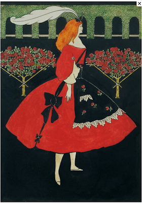
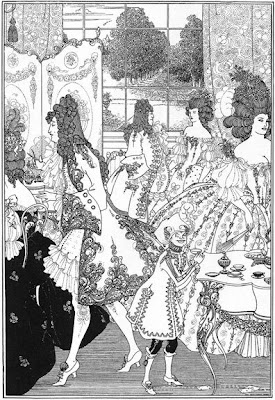
Was surfing around to find a placeholder to celebrate the week of the history of illustration genres (from this British site>>)
with Vin Di Fate. Vin was really great with a cultural overview--pointing up political, arts, celebrity, music, space exploration, nuclear/ technology in a chronological context. He set the stage for the discussion this week to delve into all sorts of pulp topics--which promises great hilarity and new insight into these historic genres and how to approach them now.This is not my world so there is a lot to learn. All of it is new. Should be wonderful.

The Lewins dove in and gently took us through a review of "how to" along with stories and approaches as it relates to the zillions of excellent books they have done. They are so engaged and kind--helping each student on his/her way to accomplishing a 32 pp. comp at the end of the week.They truly love their work, the process and creation--with a direct point of view that allows them the space to say no (an inspiration for me). New for me is the book real estate devoted to the title and half title page (3 pps of the 32 that is dedicated to intro--and not directly the story). I have collaped the "What is Pink" poem by Christina Rossetti along with the color detail spreads showing butterflies, bugs, flowers, grasses, leaves, ferns, birds, fish and such in a "find it" format. Have some work to do tonight. I am working small, and plan on scanning them in as we go through it. More tomorrow.

Murray introduced us to the Cooper Studio at lunch. He took us through the wonderful story of how he got the job at the studio--the sheer intimidation of the waiting room filled with starched men with wingtip shoes and leather portfolios with our Mentor arriving in a baseball jacket with a red rope portfolio with his drawings glued to board. It was a quick in/quick out for the other illustrators and Murray rolled in to meet Charles Cooper who silently reviewed his work and then, reviewed it again...offering Murray a space and representation--and a start at the foremost studio at the time. The artists at the Cooper Studio were compadres/family supporting and teaching each other, working on the jobs brought in by the sales staff-- The key take away was this was the finishing school for Murray, a place for him to grow as an artist and professional--working cheek to jowl with Joe deMers, Jon Whitcomb, Bernie di Andrea, Joe Bowler, Coby Whitmore, Bob Jones, Herb Tauss and many many more. I had put Haddon Sundbloom into the Cooper group and was corrected by my mentor and member of the Cooper Studios that Sundbloom (known for his Coca Cola Santas) never was part of Cooper. From Murray: "Coby Whitmore met him in Chicago and Coby was his apprentice and driver.He also gave a copy of "The Art Spirit" to Coby." That is the link.Another interesting point was that Murray was the decorative illustrator amongst all these "kiss kiss" boys. We were chatting about this in the car back to the dorm tonight--with my companions wishing that the studio system was still in place--allowing an apprenticeship program for the new illustrators and as a centralized way to promote and build a business.

Good news! I just got a note from Communications Arts!
This message is intended for Q. Cassetti at Luckystone Partners.
Congratulations! One of your entries has been selected by the 2008
jury to appear in Design Annual 49, the November 2008 issue of Communication
Arts.

And that piece was the Chicken Chokers CD cover ( in the audio/visual packaging category). Guess where the Carol Elizabeth Jones album is going!

Jackie's perfect illustration house


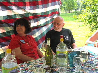
She's a perfect --with charm matches her work, her environment, and always a delight to be with . He's perfect--a musician who bakes, makes ice cream and puts together this smashing party for a pile of strangers. Little one is perfect--sending notes from his bedroom to the front hallway, who likes to sport a wonderful George Washington wig in the local parade. The house is very Beatrix Potter where you can believe that frogs can row boats and mice can bake bread. The gardens are beautiful filled with lilies, echinacea purpurea, yarrow. and campanile. There was a lovely miniature japanese maple in a corner. The yard is filled with trees and places to discover. Our hosts made two tents outside with tables and chairs, tables and chairs below the garden, and tons of places to perch in the large great room inside. There were wonderful things to eat from seafood kabobs, fruit kabobs, barbeque chicken, great bowls of all sorts of salads and lets not forget the blueberry pies with fresh peach ice cream or lemon sorbet. It was an absolute feast --from the filled plates to our eyes and senses. What an unbelievably nice gift to all of us.

Paul Z. and David L and I had a nice time at the Big Y (why not?) provisioning for the great week ahead. We got some food and fired up the grill outside and had our own mini picnic for dinner. I cook for 40 anyway...I should just cook every night...hmmmm...whats for tomorrow? it was really nice sitting outside and having a visit. Paul and David are inspiring and smart. I think I am going to learn a lot from them as artists and really good painters.

Next week's professors have arrived. I am beginning to wind up again. You know, the Tinkelmans have totally figured this out...let everyone relax...and then whamo...away we go again. This week is History of Genres with Vin DiFate(here's Irene Gallo's interview with Vin for a bit more information). We have the fabulous Ted and Betsy Lewin all week to work on a children's book (you know, the "What is Pink?" poem with the specimen box spreads in between). I am psyched to get going on this as it is said there is a wealth of information delivered...all dead on from thumbnailing the book through looking at press sheets (I have a bit of experience with this with my publications work--so maybe I won't be so lost as I have been recently). I am excited about getting going on this too.

More on Jackie Decker's beautiful work>>

A Connecticut Picnic


Luxuriant, sleeping until 8. Strolled down to the breakfast spread to find a roundtable my fellow students actively engaged in talking about art, illustration and their learning. Whoa. A lot over hard boiled eggs. Really fun hearing the recap of yesterday's museums, their impressions, their understanding, their personal work and collections. No shortage of brains, experience and ideas. Indeed, the students do a lot of teaching.

Have spent the last two hours modifying my business plan which, surprisingly has moved since 2006. It has been very enlightening and fascinating to see what my goals and hopes were in 2006 and where they have gone combined with my new understanding and knowledge. I feel I have another few hours on this--and it is extremely gratifying in the growth and in the anticipation of future growth in the next year. It's really encouraging to realize that the platform I start this program on is at a much more mature place as a designer and as truly, an illustrator. Two years ago I was reluctant to even call myself an illlustrator with belief, and now I can almost say it with my heart. The business plan says I am an illustrator...(and a designer). I have made money as an illustrator. My clients think of me as Q. And Q. can do all this stuff...which includes illustration. This is a lens I should use more often.

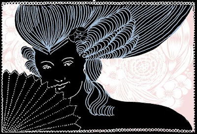
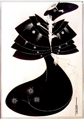
The images above are portraits from the New Britain Museum. I love the naive qualities of these images...the sheer graphic impact, the way they are designed, and how fresh they feel today.

We are off to a picnic at Jackie Decker's house. Not only is Jackie (look for the beautiful bear on the bottom of this post) an amazing person, but she is a charming, a top drawer children's book illustrator who, with the right connections could become a celebrity. She deserves it. She is taking on so much with the added week of work, but why not have 50 people on a Sunday afternoon descend on you? When does the sanctification begin? Maybe they would like a Chokers CD??

Gotta wrap it up. More later>>

More later>>

More>>


The New Britain Museum was a small, interesting collection nicely curated with illustration work hung alongside fine art. It was a tight group of images presented right as you entered the galleries. We were greeted by a strong Wyeth and a sweet Maxfield Parrish of a farmhouse, an evening image that you could almost smell the cut grass and hear the peepers and crickets. I thoroughly enjoyed seeing the pulp covers matted and framed along with the original painting. These wonderful images (shown above) were showstoppers along with as Lori Ann Levy-Holm referred to the Dean Cornwell, "a juicy one". She is right, that Cornwell is a rich one... Murray had arranged for us to see a group of images from the collection later in the day--so we had a sneak peak at some beauties from the collection.

The New Britain Museum also had a Walton Ford image with monkeys, a tremendous room of Thomas Hart Benson, a lovely Grant Wood (kind of out of the sweeter palette and and a bit more serious than my favorite Grant Wood ( George Washington as a child), a Paul Manship small bronze (but you know any Manship regardless of scale is a big Manship...they have such presence). There is plenty to see--and for all of us, plenty to talk about.

Its late.

Know your brand


The Eric Carle Museum knows it's brand from the cute signage with Eric Carle Illustrations to the bathroom with Eric Carle tiles and tiny potties for littles with decorative, floral inspired seats (my male compatriot told me that in the men's room there were painted flies in the urinal). The company car is Carle inspired as is the lobby art, the children's art studio and projects juxtaposed against simple and elegant gallery spaces with a lobby that opens up on a grassy yard planted with apple trees. The whole place felt right--and with the treats in the galleries in the show--the morning clipped along quickly filled with color texture and line.

I was struck however, with the single composition that Carle uses for all of his books. The spreads are always crossovers of a single animal or creature on a white field. It is rare when he puts his living creatures in a context--with a horizon. And the books are a bit formulaic but dead on for teaching, reading and playing out into the world of children. This museum serves the illustration world with their shows and store chock a block filled with books, providing a networking center for the children's book illustrators and a bully pulpit to champion reading, children's literature and art.

University of Hartford MFA Illustration: On the Road!


Bunny Carter (white tee shirt) waved us off--as we boarded a big red bus to go first to the Eric Carle Museum of Picture Book Art and the New Britain Museum to see their illustration collection. The Eric Carle Museum is a beautiful modern museum near Hampshire College in Amherst, Mass. They had a great show, "Flights Into Fancy" that was also at the Brandywine River Museum. There was a great collection of works featuring a lovely Jessie Wilcox Smith of Alice in Wonderland, Edmund Dulac,a delicate Kay Nielsen (sort of a rosetta stone of techniques),works by Ida Rentoul Outhwaite, an artist known for depicting fairies as children with wings. Her black and white work is exquisite and delicate. There were images from the Oz books. I learned about a new artist, William Heath Robinson's strong black and white work that may have influenced Virginia Lee Burton. I was looking at horizons and details, frames and foregrounds, something to store in the memory bank. They had a great store filled with children's books and graphic novels, art supplies and the entire collection of Eric Carle books, prints, teeshirts, and merchandise galore.

early notes

Just more notes:

> Murray suggested last night that one should scan/shoot the sketch process of the dream project for reference for a slide show on the development of an image. (Note to self: do it!).

>Remember the process for deriving palettes in CS3 Photoshop and Illustrator. What a dream. How easy to do. Really will bump the red/black/white palette I cotton to to another place. What alone is worth coming to this bootcamp and brain generator.

> Bunny Carter said to think of my illustrations in layers--like a diorama box or those cute little 3D stages made out of paper or wood for kids to play with (or to that matter, for stage designers to design in...distinct foreground, middle ground, background). I needed to put my head on my pillow to see where this could go, and I am really excited about this. Def. something to put into action.

Bunny teaches kids to illustrate, specifically for the film industry at San Jose State University. She showed us some over the top impressive reels her students have done--from the early work through that of graduate students. The sheer energy and brawn of all of these students and the process they go through to become ready to spring into these film jobs is mind bending. Which explains her reference to where the camera is, talking about illustration in the context of film making, and with that how the story breaks out into frames or images. She thinks within the frame with her decades of illustration experience, within the context of being raised with illustration and art, and her own developed understanding of how it all links together. I think as my mind relaxes, I may understand more of what she said, and what it means, and how I can use it to my benefits.

> Talking with Dennis Nolan with an extrordinary boost for me (and I know many others of my classmates)--he delved into the world of ideas and reference, a balm.

He talked about how it (in his mind...) is hard for women particularly to open up--to allow themselves a chance to not be responsible, to expand beyond what they know--to trust themselves the space to evolve. As I think about it, he may be on to something which I originally had chalked up to a bit of sexism...but it's not. We women do have a different gearing with the general management of lives, eating, living, and the design of all of that to be woven in with the money making aspect of our lives (work), and broad life planning. We are presented with life and we have to make sure everyone else is living it--putting yourself in a fade--giving and thinking for and about others. I do not complain about this role. But, one assumes it as for me, the whole kids/work thing was something I had a dim understanding of when they put the tiny baby in my arms at the hospital and waved goodbye. There is no clear road map for any of this stuff--we learn as we go, but we never focus on what is in the mirror and work on that person.

For me, this has been structured, listed and planned in parallel with everything else --ie: get milk, pay taxes, get thus and so done for thus and so....so where does "find yourself" fit in the listmaking? Somewhere between get the snowtires off in June, buying tickets for Christmas in August, making sure the treeman comes to cut off the dead limbs before someone gets clobbered with one, and the design of a crystal cupcake? I don't think so. This self development is what got many of us gals to the program...and maybe, it could in a rudimentary way be put on the list of doing and executing stuff--scratching at the surface--but not going deep. Maybe this will happen for me? So, I think I was wrong in my initial impression of the idea Dennis floated out.

He also gave me a slew of references that could help with my thinking...many of them being japanese artists (prints) who I have adored and looked at forever, never really seeing the context--and being absorbed by their color and story. Need to put down all the google fodder for reference later.

Business plan due for Jim Carson by August 15. I can revise the existing one.

More later>>

Two demos, two crits, two movies and maybe some sleep


Paul Zdepski captured the doings for today>> Dennis Nolan, illustrator and teacher gave a seemingly simple demonstration that showcased his honed sensibilities and eye in the development of a basic palette that he works with this students and his more restrained "earth" palette he uses with his own work. Dennis does something I have never seen which is to build his colors up from yellow, to red then blue building the color up the same way we lay down CMYK on printing presses. His demo made me itch to open my watercolor box...alas, I had left my key in my pocket at the dorm --forgetting it in the stupor of trying to function this morning.

The incandescent Ron Mazellen demonstrated his new oil technique which was perfected after his children's book project was completed. With the extra time, he embarked on a significant body of work with football as his topic--completing (I am going to get this wrong)9-12 paintings in less than 6 weeks. They are fresh, free and quite a break from the safety of the book. It is inspiring to see his change, a new style and techique reinforcing his confidence and quiet philosophy. I hope in a year, I can be as developed and as enlightened as Ron.

Alice "Bunny" Carter assembled our sketches and color finishes into a presentation she projected and reviewed. Everyone to a person moved forward a square..some even more --but progress all around. It was tremendous to see how everyone had developed their project with some surprises insofar as where the content and concept went, and how the color and techiques would be applied. If this is the kick off--the future is promising. Bunny gave good insights, gentle and yet taking the ideas close in on some, and way out on others. I need a bit more sleep and then I plan to dive in and redesign these pieces, get a rapidograph and get jumping. Murray suggested brown lines (or paynes grey) with color. Hmmmm. I shot some images from the show and will ask around if its okay for me to post for you.

The more senior group had digital work this week and the results were stunning. Every one of them a homerun. They worked in illustrator, photoshop and painter and combined them into a portrait or a merchandising idea. All very real, very marketable.

I wish I could be more enlightening but my eyes are closing. More later before our bus trip to see more illustration. Ciao!

top: left> David Brinley, Paul Zdepski, Dennis Nolan
second from top: left> Bunny Carter, Molly Bozarth, Ed Tuttle
third from top: Murray Tinkelman standing on the tables to shoot pictures of the Dennis demo.
second from bottom: Linda Tajirian, Ed Tuttle
bottom: David Monette, Lori Ann Levy-Holm.

Onward!


Dragged myself out of bed (didn't hear my alarm). Quick work getting our pieces ready to show and for a crit this afternoon. Am feeling like I have a direction, but that these pieces still need quite a bit of work. My compatriots have wonderful work (reminder: take the camera for the final crit...maybe I can get some images for you). The group has fused as a unit and the walls are down. These projects have been remarkable getting us to talk to each other, to the teachers and talk about our fears and phobias.

I have had remarkable direction from Murray--not only how I should regard myself but also how I should proceed with my work. His vision is clear and steady..and I trust him. I had a good thesis conversation with Doug Andersen and Murray. It's pretty clear that I am going to be forced out of my corner with figures and fields, with horizon lines and reference--and color--to try my wings and see where it takes me. I do not know if my progress will be noticable at first, but I need to get the wheels moving so as to see growth by November. I need to leave my fear and negativity at the door (as directed by the team) and focus on work and what I can do. Can do, not what I can't do...and not look to the exquisite painters in the room, but focus on my fellow decorative illustrators (including the Sienese School, the ancient egyptians, and wonders like Kay Nielsen and Murray Tinkelman). Another deep breath. And, for that matter, why compare. Just focus on what is in front of you. It's simpler.

time out.

Phew. Coloration tomorrow a.m. That means I will have two hours to focus on one to color and add tone/texture to. Maybe whomp up what is here. Oh, what's that I hear? My bed is calling me! More of an update tomorrow a.m. (early).